This is the fifth part of the Mobile Growth Series, which aims to help you take your subscription app to the next level. In each episode, we will provide insights into topics related to data, product optimization, and growth strategy. Subscribe to our newsletter to stay updated about future episodes.
Maximizing Revenue with Strategic In-App Subscription Models
In the United States, a whopping 79% of the top 250 apps by spend generate revenue via in-app subscriptions. On iOS, this number is even higher – reaching an impressive 94%.
Despite this trajectory, it’s critical to have a strong monetization strategy in place to achieve a competitive Lifetime Value (LTV) that can unlock paid user acquisition at scale.
A key factor in increasing revenue is monetizing most of your app’s users. According to RevenueCat’s State of Subscription Apps 2023, less than 2% of app downloads result in paid subscriptions.
Failing to monetize early, specifically within the first few minutes or hours after installation, can lead to a substantial loss of potential revenue for subscription apps. Understanding user behavior early on can significantly impact subscription rates.
Getting a user to subscribe is essential for a successful business. To achieve this first payment, it’s important to focus on a crucial element: the paywall.
What is a Mobile App Paywall?
A mobile app paywall is a screen that restricts access to premium content or key features within the app. Users must pay or subscribe to unlock these exclusive elements.
Below are a few examples of a paywall screen within an app onboarding flow:

When it comes to product optimization and mobile growth, it’s easy to get lost in the myriad of strategies and best practices.
This article includes five paywall experiments along with real examples from our work with subscription apps. These tests are easy to implement, and based on our experience, they have the potential to boost revenue by up to 40%.
Cheat Sheet: 5 Tests To Optimize Your App's Paywall
User behavior analysis can offer insights into optimizing this crucial touchpoint for better paywall conversion rates. Below is a concise cheat sheet that includes five key testing ideas for optimizing your paywall strategy, as well as the potential uplift you can anticipate.
Keep in mind that these benchmarks should be used as a general reference. Each mobile app is unique, and the impact of these tests may vary based on prior experiments and the existing optimization level of the paywall.
You can also download the Cheat Sheet HERE to keep your paywall strategy easily accessible.
1. Strategic Paywall Placement
Expected Uplift: Up to +234% in conversion rate.
Key Elements to Test:
Timing: Place the paywall after varying lengths of onboarding.
Location: Place the paywall where it will have a high visibility rate.
2. Paywall Design
Expected Uplift: Up to +20% in conversion rate.
Key Elements to Test:
Introduce a pre-paywall page for a smoother transition.
Enhance user communication to reduce friction.
Implement a progression system within the paywall design.
3. Paywall Length
Expected Uplift: Up to 65% in conversion rate; up to 12x in revenue.
Key Elements to Test:
Compare the performance of longer, detailed paywalls versus shorter versions.
4. Paywall First Impression & Unique Selling Proposition (USP)
Expected Uplift: Up to 20% boost in conversion rate.
Key Elements to Test:
Experiment with different USPs focusing on clear benefits (avoid feature-based USPs).
Utilize visually appealing designs to create a positive first impression.
5. Paywall Plans & Pricing
Expected Uplift: Up to 40% increase in revenue.
Key Elements to Test:
Apply a Price Sensitivity Meter to determine optimal pricing.
Experiment with various packaging options and decoy effects to enhance revenue potential.
Having outlined the basic concepts of each test, let’s now explore each one in more detail.
Test #1: Strategic Paywall Placement
How can you cleverly integrate the paywall into your mobile app onboarding process?
When deciding on the placement of the paywall, it’s important to consider two factors: its location and the timing of its introduction.
Displaying the paywall too early (timing), before the user experiences even a glimpse of the app’s value, may lead to losing potential loyal users.
On the other hand, ‘hiding’ the paywall (location) could result in missed opportunities to maximize revenue. It’s crucial to keep the paywall visible. Although it may seem pretty obvious, the paywall doesn’t always get the attention it requires, and developers hurt their revenue by not ensuring that it stands out.
We recommend taking these two dimensions into account when conducting A/B testing related to the paywall. The clear goal is to achieve a 100% visibility rate, meaning ideally, everyone who opens the app should see the paywall at least once.
To illustrate the importance of the paywall location and timing, let’s explore a practical example from the AppAgent team.
Billdu, an invoicing app in the Finance category, streamlines billing for over 600,000 freelancers and small businesses.
Billdu’s team approached AppAgent with the goal of increasing their app’s downloads as well as the number of paying users.
AppAgent conducted a comprehensive growth audit, analyzing the user onboarding flow in detail, and recommended a prioritized list of experiments related to onboarding and the paywall.
Before beginning collaboration with AppAgent, the Billdu app featured a relatively brief onboarding process with just a few screens (see below), none of which adequately introduced the app’s benefits to new users.
The paywall was also ‘hidden’ within the app’s settings. After completing the onboarding process, users were forced to navigate through an additional three (!) steps to encounter the subscription plan.
AppAgent’s primary hypothesis involved strategically using mobile onboarding to emphasize the app’s value and adjust the placement of the paywall.
The app onboarding process consisted of these two simple steps:
Step 1: Improve the First Time User Experience (FTUE) by highlighting the value and benefits during onboarding.
Step 2: Ensure that most existing users see the paywall by placing it immediately after the onboarding process. This way, users have sufficient time to explore the app, and purchasing a subscription doesn’t require additional effort.
For more insights, check out our previous article on mobile app onboarding best practices and strategies for immediately capturing user attention.
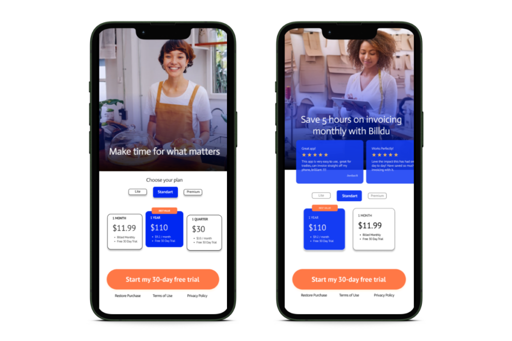
Let’s take a look at one of the tests we conducted, which helped Billdu increase its subscription conversions by 20% compared to the previous version.
In this test, we placed the paywall after the initial onboarding screens (location). It also appears later than in the initial version due to a longer mobile onboarding process (timing).
💫 Pro Tip: If you’re concerned that introducing a paywall during the app onboarding process might increase churn rates, consider adding a clear ‘Close’ button on the screen.
This prevents mobile users from feeling trapped, a concept known as ‘The Impact Of Transparency.’
💡 What is The Impact Of Transparency?
Transparency becomes crucial when app users consider leaving the paywall, as it is key to maintaining a positive user experience. Make sure the exit button is prominently displayed and easily identifiable, allowing users to effortlessly exit the paywall if they decide not to subscribe.
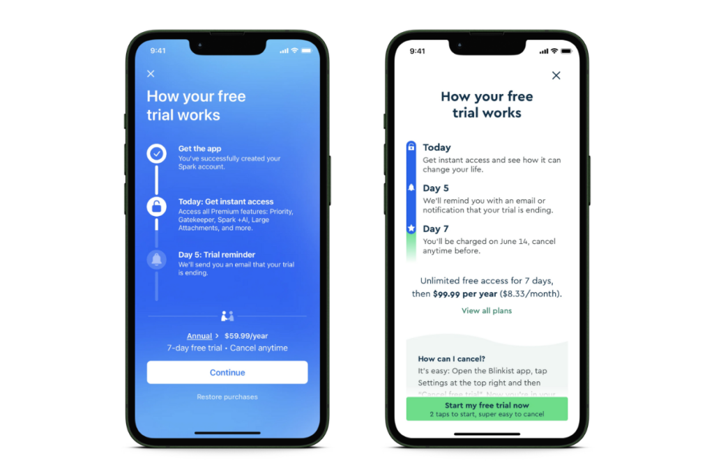
An extreme example of this is Blinkist’s widely recognized and successful paywall. It presents a straightforward path to users by setting clear expectations about the trial and subscription on day 0, day 5, and day 7. This paywall even explicitly explained how existing users could cancel the subscription.
Test #2: Paywall Design
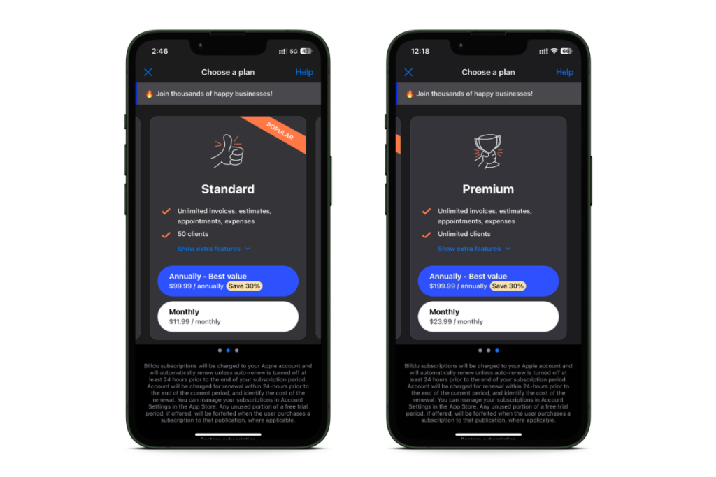
The second hypothesis we aimed to confirm for Billdu was that users struggled to properly compare the app’s various subscription plans.
As illustrated below, users needed to scroll between subscription plans to compare the differences between the two options (Standard vs Premium).
Each element of the paywall influences the user’s psychology and their decision to pay or not. For Billdu, we redesigned the paywall to provide clarity and reassurance, helping users easily determine the option that best fits their needs.
We consolidated all elements onto a single page by modifying the user interface (UI). This process involved redesigning the close button, background, visuals, headline, pricing, and the list of benefits for subscription plans.
Leveraging our internal best practices, insights from previous successful experiments, and psychological strategies, we developed multiple versions of the paywall that aligned with our hypotheses.
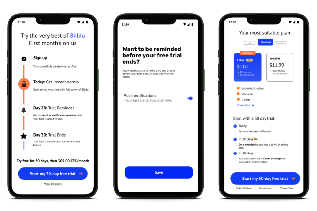
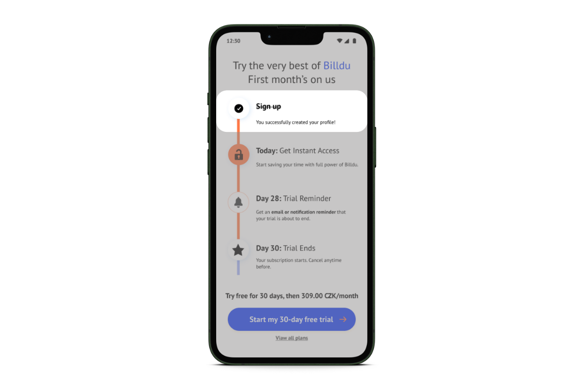
💫 Pro Tip: Show progression on the paywall–not just during onboarding–to encourage users to continue until the end.
💡 What is The Goal-Gradient Effect?
People are usually more motivated as they get closer to a goal. Showing progress, like pre-stamped spaces on a loyalty card, tends to boost the eagerness to achieve a goal.
Applying this idea to a trial paywall and indicating that the user journey has started can increase the likelihood of them completing the process.
Test #3: Paywall Length
Is a long paywall more effective than a short one? This is an ongoing debate.
Based on our experience, long paywalls that provide detailed information and benefits often outperform the shorter versions.
Why might this be?
We believe that when it comes to spending money, people generally prefer to know exactly what they’re paying for, making a longer paywall more useful in this context. This does, however, vary greatly depending on the industry and user expectations, so it’s always important to test!
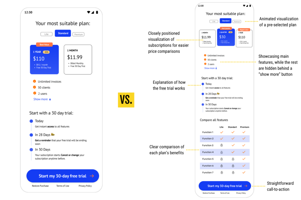
Take a look at the experiment we recommended to Billdu, which compares two different paywalls. This was done to test our hypothesis: users require additional context to feel confident about their decision when opting for a trial or subscription.
Test #4: Paywall First Impression & USP
It takes only seven seconds for mobile users to make a decision.
The human brain instinctively reacts to beauty without conscious awareness. Visually pleasing aesthetics evoke positive emotions, elevating the user experience and shaping consumer perceptions, which, in the end, impacts their willingness to pay. This is something known as the Halo Effect.
💡 What is The Halo Effect?
This effect implies that if one part of a product looks impressive, people tend to perceive the entire product as excellent.
For instance, if a paywall appears visually appealing and polished, we might assume that the product is also outstanding, even without testing it. By establishing a great first impression and making the subscription plans visually attractive, you signal to the user that the product is of high quality and worth the payment.
Another hypothesis we aimed to confirm was that users at this stage are motivated by urgency to find a billing solution and may not be well-connected or aware of the benefits that the product can provide.
Below is an example of how we integrated a distinct Unique Selling Proposition (USP) like ‘Make time for what matters,’ complemented by an image designed to evoke positive emotions associated with happy small business owners.
Test #5: Paywall Plans & Pricing
Determining the right subscription fee for mobile apps can be challenging, as the immediate impact on user retention isn’t readily apparent. It involves assessing user cohorts based on the charged price.
At AppAgent, we’ve developed specific testing methodologies to better evaluate these long-term effects and avoid false positives.
One option to identify the perfect price for your subscription is via a technique called The Price Sensitivity Meter (PSM), which gauges how responsive users are to changes in price.
To conduct this analysis, having a substantial number of active users is crucial.
Here are some questions to consider asking your users:
What price do you consider a good deal for the product or service?
At what point does the price become so low that you question the quality?
What is the maximum price you’d pay for the product or service without hesitation?
At what price would you find the product or service too costly to consider buying?
By analyzing user responses to different price points through surveys or feedback, the PSM can help you find the sweet spot where users perceive good value for their money.

However, determining the price is only part of the equation; the ‘packaging‘ also plays a significant role.
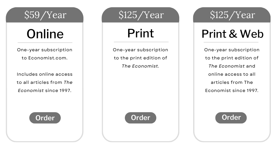
Let’s briefly step outside the mobile realm and consider an illustrative case from The Economist magazine, which utilized distinct plans for subscriptions (source):
The online-only edition for $59 per year,
the print edition of the magazine for $125 per year,
or the print-and-web combo, also for $125.
In a survey, 84% of respondents chose the last version (print-and-web combo). However, when the middle option (just print for $125) was removed, only 65% of people opted for the last version.
The reason? Simply having the middle option made it much easier for potential customers to compare the value of each offer.
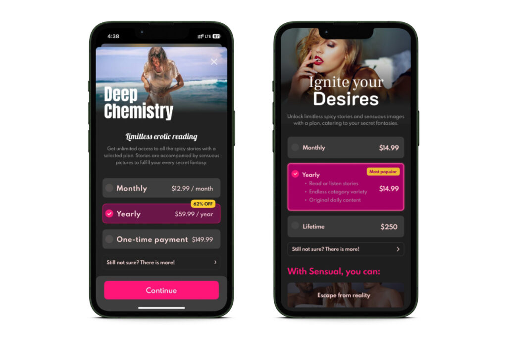
Applying the same logic, we proposed a straightforward experiment we conducted for Sensual, an app that features erotic stories for adults. Below, you can see the A/B test we performed to validate this assumption.
The paywall displayed on the left is the original version, while the one on the right represents the updated version.
In the original version, the app featured three pricing options, focusing on the middle (Yearly plan). However, the distinction between this and the Lifetime plan wasn’t pronounced enough to effectively highlight the value of the yearly offer, potentially making the Monthly plan appear too ‘cheap’.
We challenged the app’s developer AppToro to increase the pricing for the Monthly and Lifetime plans, aiming to enhance the conversion for the Yearly subscription using the decoy effect.
💡 What is The Decoy Effect?
This psychological phenomenon reveals how the introduction of a third choice can subtly alter people’s preferences. Imagine initially favoring the cheapest option A over the pricier option B, only to reconsider B when a third option C enters the scene.
In the updated version of the paywall, we also included a list of benefits related to the Yearly subscription plan to reinforce the final effect.
For those interested in the impact of these seemingly minor changes, they resulted in a significant revenue increase of +40%.
Final Thoughts
Ensuring a strong conversion rate from app installs to subscriptions is crucial for a successful business. By strategically fine-tuning your subscription app’s paywall, your businesses can increase the likelihood of monetizing new and recurrent free users.
To see results as soon as possible, it’s important to prioritize A/B testing of the paywall in the correct way. You should center each test around a strong hypothesis that explains why the user will convert better after you introduce a change.
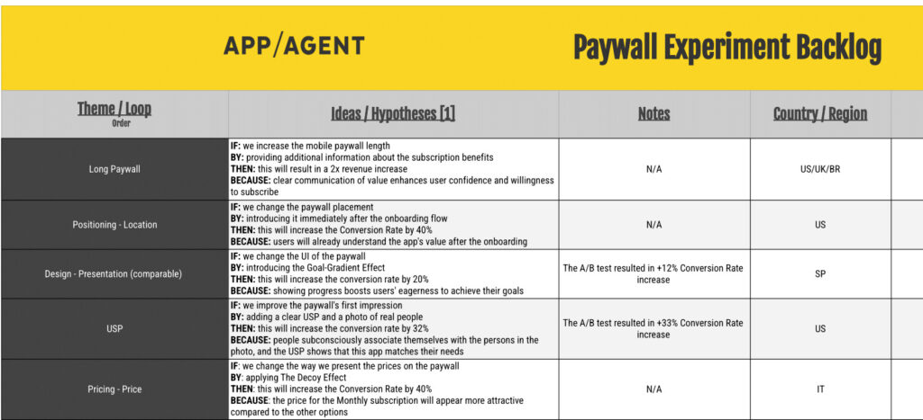
The Paywall Experiment Backlog
Optimizing paywalls involves continuous testing. To stay on track and monitor your progress, it’s critical to maintain a paywall experiment backlog.
Highlight successful experiments, note conversion improvements, and record key learnings for future cycles. This systematic approach refines strategies, improving your app’s performance. Backlogs are essential for tracking past actions and outcomes.
Leveraging historical data enhances the assessment of potential impacts and prioritizes future tests effectively.
Download the blank template HERE.
