So many people waste time and resources on their App Store Optimization (ASO) by copying other people, without having any proof that their activities will make a difference.
To help explain what I mean, I have analyzed the ASO strategies of over 20 apps to provide you with a truly data-driven look at the impact of iOS 11 on keywords and conversion optimization.
The apps I have chosen cover a variety of categories, including finance, health & fitness, travel and gaming. I have also included some interesting insights from industry experts to provide you with a comprehensive guideline for your post-iOS 11 ASO strategy.
Executive Summary
1. The title has a bigger impact on rankings than the subtitle.
2. You can leverage the subtitle to create more keyword combinations, using them alongside the title and the keyword field.
3. The Store page is still a key conversion point. We know that users don’t install more apps from the search results.
4. A single 30-second app preview video with portrait screenshots converts better than three videos, or a combination of video with landscape screenshots.
5. Keyword optimization difficulties remain the same in iOS 11.
6. Duplicating keywords in the title, subtitle and keyword fields won’t increase rankings.
1. Keyword ranking changes
Does iOS 11 influenced rankings in some way or not? To find out I analyzed five apps from different categories, all of which used the same keyword set during the monitored period to track the potential impact of the iOS 11 algorithm before and after it was changed.
Below you can see ranking changes for these apps. The rankings changed over time — from two weeks up to two months — but there wasn’t any change in their ranking immediately after the release of iOS 11.
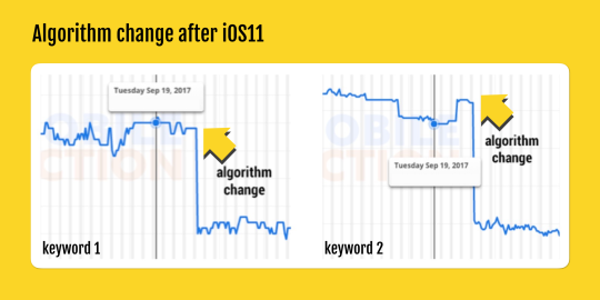
The analysis above represents a standard dynamic of rankings that are affected by download velocity, bad ratings, changes in competition etc., rather than by iOS 11 which was launched on 19 September.
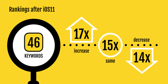
However, between October 15 to 17 there was an algorithm change that drastically affected some rankings. From the apps that I analyzed, the majority of them dropped in the rankings rather than climbed. In many cases they never went back to their previous positions.
The October algorithm change has not impacted all keywords. In fact, many of them remained in the same position.
Key takeaways: The arrival of iOS 11 hasn’t impacted rankings; the increase and decrease in position was standard. The algorithm changed in the middle of October wasn’t the only one, in fact it happened several times during 2017 (at least 3x). This analysis proves that keyword optimization difficulty remains the same with iOS 11, as it was in the past.
2. Do iOS 11 users download more from search results?
We can assume that giving visitors three screenshots/one large landscape screenshot/preview video with autoplay in their search results will be enough for them to make a download decision without visiting the app’s page. For the analysis I’ve picked apps with screenshots readable even at thumbnail size on the search results page.
What I focused on here was the ratio between page views and app units, before and after iOS 11. It’s a simple conversion rate which should provide a representation of an increased number of installs from search (if page views remain the same, and app units grow right after the change to iOS 11).
Of those apps I analyzed, four apps experienced a decrease in conversion rate after iOS 11, one app an increase, and the other four remained the same.
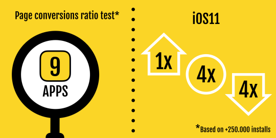
Key takeaways: There’s no pattern to suggest that download behavior has changed before and after iOS 11. You should still consider the app detail page as an equally important conversion point.
3. Duplicating keywords
There were rumors that duplicating keywords in the title, subtitle and keyword field might help you in the rankings after iOS 11. It sounds interesting and it would be very similar to the way the Google Play store works if it were the case. To check if this was happening I made a test and added — for ’safety’ reasons — keywords to the description just in case Apple started indexing it. What happened? Nothing.
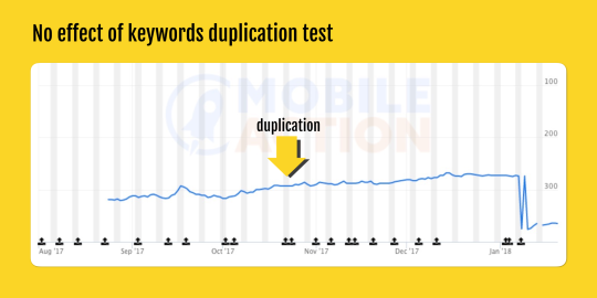
Key takeaways: Don’t bother to duplicate keywords. Apple might decide to change this at some point in the future, but for now, there is no reason to include the same keywords because this strategy won’t help you. Instead, it’s better to free up space and use different keywords in the title, subtitle and keyword field.
4. The strength of the title, subtitle and keyword field
I have read some articles that claim the title and subtitle fields are equally important. However, it is not true. In the example below I switched keywords between the subtitle and the title to see what would happen.
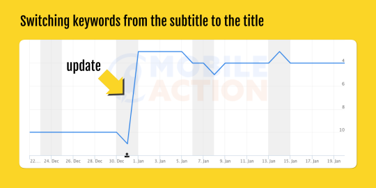
Rankings increased, which is proof that the title is more important when compared to the subtitle field. Next, I switched keywords from the keyword field to the subtitle. Again, rankings increased which proves that the subtitle has a stronger impact on rankings than the keyword field.
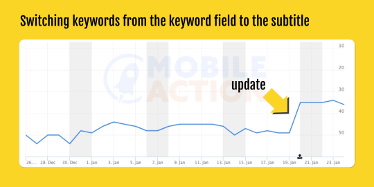
Key takeaways: Put your best keywords into the title. You can increase your rankings a lot by doing so. The subtitle has the second biggest weight in the ranking algorithm and the keyword field the lowest weight.
5. Cross-keyword combinations
Recently I explained how you can combine keywords in the title, subtitle and keyword fields. This approach worked in iOS 10 already, but in iOS 11 where the subtitle field is available, it’s even more important to utilize this strategy.
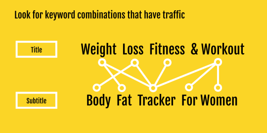
I demonstrated in the previous section that the subtitle field has less weight than the title and that the subtitle field has still more weight than the keyword field. So, focus on the title and the subtitle first when working on combinations. You can see how this works in the example below:
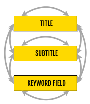
When creating combinations, firstly focus on keywords in the title and combinations between them; then combinations of title and subtitle; and finally combinations of keywords in the subtitle itself.
Put the rest of the keywords in the keyword field and still try to combine them with those two fields. Why? Because your ranking will be higher than if you only create combinations in the keyword field.
Even if you have one keyword in the subtitle and one keyword in the keyword field, your ranking will be higher than just leaving these two keywords in the keyword field.
Key takeaways: Leverage the new subtitle field and try to combine your keywords within it as much as you can. Some people say that you should only focus on keywords that have the best clicks from your search ad, but if those keywords have serious competition (and you can’t reach top 5 or 10 organically and don’t want to use any black hat tactics) than there is no reason to focus on them. Instead, concentrate on combinations that have lower competition because it’s likely that these will be more effective for you.
6. Screenshots and videos
In this section we will look at App Store bugs relating to visual assets, how we improved a client’s conversion rate by 66%, and what combination of screenshots and videos work the best.
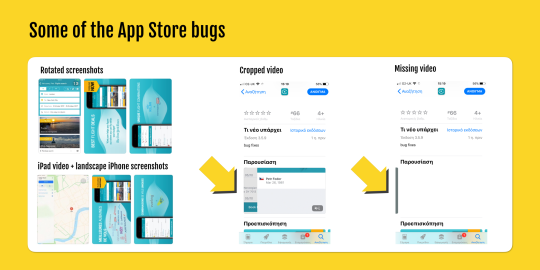
Firstly, I would like to talk about App Store bugs we have seen so that you can avoid similar confusion. Be aware that landscape screenshots with a portrait video result in 90° rotation of screenshots. Then, if you remove iPhone video while still keeping your iPad video, you will see that iPad video even when visiting the store page on your phone which is pretty bad in terms of user experience.
Another bug appears on the app page. We’ve tested 3×15 preview videos with landscape screenshots. It shows all three preview portrait videos zoomed in, cropped and sometimes even blank. You can see what this looks like below. Tapping any video leads the App Store app to crash, a bug that we have verified on multiple devices. Therefore, avoid combining video and screenshots with different orientations, because it’s not optimized by Apple yet.
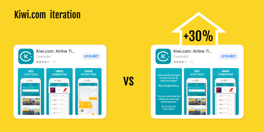
When we were optimizing the Kiwi.com app we tested portrait and landscape screenshots. The horizontal format brought a rather small increase of just 7%. What shocked us was the massive 30% increase we saw after using a testimonial from NY Times as our first screenshot — it clearly built trust with customers. Next, three app preview videos didn’t increase the conversion rate, but a single video did by 29%.
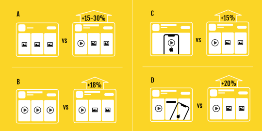
The findings of these experiments have been confirmed by Sylvain Gauchet (Apptamin) and Splitmetrics, who both shared their insights with us. For some of their clients Apptamin saw a 15–30% increase in conversion rate by adding a video into the app preview (Image A). Splitmetrics data show that one video performs 18% better than more videos (B).
As we’ve touched on video orientation, here’s another interesting insight: portrait app previews for portrait-mode apps perform better than landscape previews by 15%. It makes sense to stick to your app’s orientation, a fact that’s probably related to better “readability” of the video content.
If an app publisher uses a single portrait app preview followed by two distinct screenshots showing different features, the conversion rate is 20% better than using two split-screenshots with one message (D). Here it seems people simply like to look for more information.
Key takeaways: Experiment with landscape screenshots and content, but be careful with different video and screen orientations. Stick to a single app preview video in the same orientation as your app is. Make your first two to three (depending on usage of video) screenshots information rich.
SUMMARY
I hope that the experiments and data analysis in this article have helped to debunk some of the popular iOS 11 ASO myths. I advise you not to believe what others say unless there’s clear proof, and ideally to do your own tests to verify what works best for you and your app.
We will be constantly updating this blog post with more insights. We would like to say a big thanks to our contributors, namely Sylvain Gauchet and Splitmetrics.
If you want to see more in-depth ASO stuff then please sign up for news at appagent.co. Also feel free to comment below and share the post with your friends and colleagues who may also benefit from ASO insights.

