Working on over 60 store listing experiments in the past year has revealed to me some important lessons – and provided lots of surprises as well.
It’s now much clearer to me that improving store conversion is one of the cheapest and the most effective ways of user acquisition. Even with 50 organic downloads a day, a 10% improvement in store conversions can generate an additional 25,000 free installs in just a year!
With 50 organic downloads a day, a 10% improvement in store conversions can generate an additional 25,000 free installs in a year.
Beyond that though, a better conversion can dramatically decrease the cost of paid acquisition. That’s why we always start with ASO before scaling campaigns. To help test my theories I went through past Google Play Experiments and recent tests at Splitmetrics, Storemaven and TestNest to explore what makes a successful store listing.
Here are my 5 practical tips for improving store conversion:
1. Look for inspiration outside your category
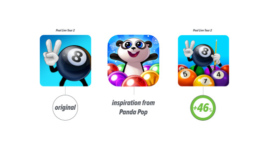
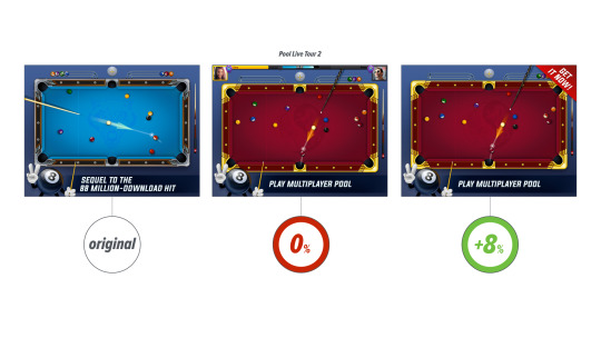
Checking what others do helps inspire me to come up with new ideas faster than starting from scratch. But it’s not a problem. If, like me, you remember “shouting faces” icons in the strategy games category, you probably agree that games are full of copy cats. The tip is to look at different game genres. While considering a new concept for Pool Live Tour 2 we’ve been got inspired by a match 3 game called Panda Pop and the new icon for pool game totally blew our minds, it performed by 34% better!
2. Be bold and crazy
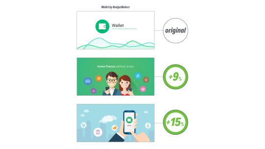
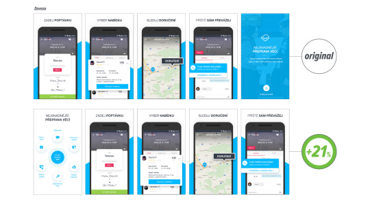
The key rule I always push is to test very different creative directions. Our large banner for Wallet by BudgetBakers is a good example. The original brand version went to test with a catchy image of an illustrated pair and a city skylight, both very different executions of a concept. ‘Pair’ performed by 9%, but ‘Skylight’ was 15% better! Another interesting result came from a delivery startup Zavezu which we’ve launched this autumn. The best performing first screenshot we’ve designed presents six use cases, not the app itself! But it’s working. A 21% improvement is a strong argument to think out of the box, don’t you think?
3. Monkey see, monkey do
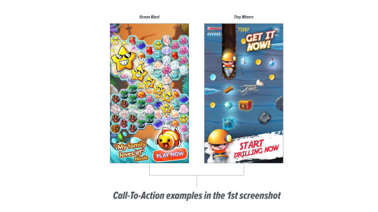
My colleague Edward – one of the greatest minds in performance marketing – always pushes an interesting approach. He always says: “Monkey see, monkey do.” In other words, use your screenshots to simply tell people what you want them to do. That’s why we use call-to-action claims in the first screenshot. It might feel strange to do it in the first one, but Storemaven – which is mostly working with enterprise clients who usually have very polished store listings – claims only 33% users scroll screenshots on iOS and 15% on Google Play. Nick Kurat from TestNest claims somewhere between 18-25% depending on category and audience. The lesson is: You need to convert most of the audience with your first image.
4. Description (almost) doesn’t matter
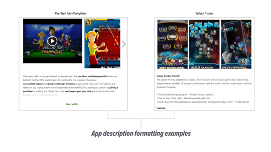
Did you know that only 2% of users on App Store and around 5% on Google Play expand the app description? It’s actually quite shocking. As a result, you have to focus on the “above the fold” part – that’s the first paragraph. (The rest is good for ASO, especially on Android so don’t ignore it of course.) What I recommend on Google Play is store listing formatting which repeatedly performed by 7% better. A mind-blowing insight for us was that by using an award mention for Ocean Blast, it performed 27% better than a version without it. Social proof works as well, so don’t forget to include any testimonials or awards in the opening part of the app description!
5. Video as the last
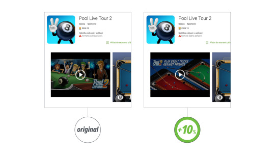
Not only as the last strategy today, but video should be also the last on your production to-do list. Nick from TestNest sees 5-8% view rate where Storemaven guys are more optimistic with about 10%. Good videos have 40-55% completion rates with a 10% drop every 5 seconds. Considering production costs, video is quite an expensive bit of fun. If you go for it, show value within first 10 seconds and never go beyond 30 seconds duration. Make sure you experiment with the cover image because video takes the spot of the first screenshot and can highly effect your download rates, something what Kaban also found with MARVEL Contest of Champions. It can work well though. Storemaven claims that users who watch video are 3x more likely to install.
IMPORTANCE OF STORE ASSETS
The most important things you have to focus your optimization efforts on are:
App Store:
- icon
- two screenshots (in case of no video)
- video thumbnail and first screenshot (in case of video)
- first few lines of description that go before ‘more’ link
Google Play:
- featured image
- icon
- short description
- first 2 screenshots
