Blog
Mobile growth insights in the form of in-depth articles, guides, and best practices.
Featured
SUBSCRIBE TO RECEIVE
MOBILE growth INSIGHTS

Discover 5 powerful ways AI is shaping mobile game creative—from characters and animations to ads and UGC—and how studios boost engagement, ...

Playable ads are exploding in 2025. Discover key trends, top-performing formats, and how to scale UA with interactive creatives in this data...

Why do players open the same mobile game every single day — without a single push notification? This phenomenon isn’t driven by fun gameplay...

For years, Google has been diluting the core value of search in favor of profit. Paid rankings and sponsored content now dominate the result...

Discover 5 ASO trends for 2025 that unlock app growth—covering metadata, in-app events, organic visibility, and conversion wins.

Why disturbing mobile ads go viral—and how brands can hook users with better, safer creative strategies that still perform.

Master the art of mobile video ads—grab attention in just 4 seconds with emotional hooks, visuals, and sound that stop the scroll.

Struggling with UA, monetization, or stalled growth? GamePlan™ is a data-driven audit that diagnoses issues & unlocks scalable success. ...

Discover 2025's top AI trends—from hyper-personalization to virtual influencers—reshaping gaming, marketing, and creativity. 🚀

Master mobile marketing with AppAgent's video course on creative strategy—actionable tips, hooks, & iterations in 4-6 min lessons!

As the mobile app industry evolves, many companies struggle to keep up with the latest trends and adapt through effective strategies. As a s...

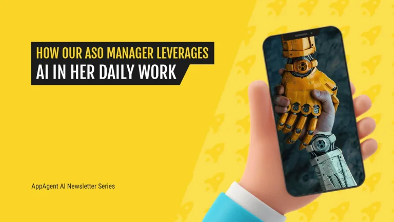
It’s hard to imagine AppAgent without AI! See how our ASO Manager uses it daily to boost expertise while keeping a human touch.
Download the
Creative Testing Guide
Bring your creative testing process to the next level with AppAgent’s bulletproof method, backed by top mobile publishers.
