This is the fourth part of the Mobile Growth Series, which aims to help you take your app to the next level. In each episode, we will provide insights into topics related to data, product optimization, and growth strategy. Subscribe to our newsletter to stay updated about future episodes.
This article aims to take you on a journey through different types of mobile onboarding experiences. We’ll show you practical onboarding flow examples, along with tips and psychological tricks to help you improve your own onboarding process.
In this article, you will learn:
- The concept of onboarding flows and their significance.
- Examples of popular apps that utilize onboarding flows.
- The visual appearance of onboarding flows within app interfaces.
- Strategies and tips for crafting a meaningful onboarding experience for your users.
Table of Contents
What is a Mobile App Onboarding Flow?


Before delving into the various types of onboarding experiences, let’s begin by clarifying the concept of an “app onboarding flow” or “new user onboarding flow” (these terms will be used interchangeably throughout the article).
Simply put, an onboarding flow is a step-by-step process that introduces users to a new app. It walks them through the main features, benefits, and how to effectively use the app.
The onboarding process concludes once users have gained meaningful value from the app, a point that varies based on both app specifics and user preferences. In this article, we’ll narrow our focus to analyzing examples of clear and coherent onboarding screens found in popular apps.
What are the Main Goals of a Mobile App Onboarding Flow?
The user onboarding process is a pivotal phase in the customer lifecycle, acquainting users with your app and ensuring they have a positive first impression. The goals of this process can vary based on the nature of your app and the approach you choose to take.
Let’s explore some of the primary objectives that can guide user onboarding:
- Educate: Ensure users know how to use your app and understand its value. For instance, you can use tooltips to guide users as they explore the app.
- Personalize Experience: Make each user’s app experience unique and special. For example, you can ask different questions during onboarding to tailor their experience.
- Set Up: Gather important information from users to help them begin using the app. For instance, you can prompt users to create an account or enable notifications.
Why are New User Onboarding Flows Important?
Understanding the significance of user onboarding flows is essential for creating a user-friendly app experience. Here are a few reasons why these processes are so crucial to the success of your mobile app:
- Reduced Churn Rate: Apps that have a confusing onboarding process or lack one entirely tend to lose users faster. If new users find it hard to get started, they might give up on the app altogether.
- Increased User Retention: An effective onboarding flow encourages more users to stick around. When new users grasp the app’s value early on, they tend to stay engaged and become loyal users.
- Improved Conversion Rates: Effective onboarding can boost conversion rates, especially for apps with paid features. Users who perceive the app’s value upfront are more inclined to upgrade or subscribe.
- Lower Support Requests: A simple onboarding flow results in fewer users needing assistance. When people understand the app from the beginning, they’re less likely to encounter problems and ask for help.
What Does A New User Onboarding Flow Consist Of?


Before we delve into the different types of onboarding flows, let’s familiarize ourselves with the fundamental building blocks of effective user onboarding experiences. A successful user onboarding flow usually incorporates the following key components:
- Welcome Screen: This initial step greets users and acquaints them with the app’s purpose and its main features.
- Account Creation: This involves signing up and creating an account to access personalized content and monitor progress.
- Tutorials: Interactive guides provide step-by-step instructions on using the app’s core features.
- Personalization: Collecting user preferences to help tailor the app’s experience to individual needs.
- Notifications & Permissions: Users are informed about notification settings and asked for necessary permissions.
- Helpful Tips & Support: Offering tips and help options to help new users understand and navigate the app.
- Completion & Continuation: Celebrating a successful onboarding experience encourages new users to continue using the app.
Keep in mind that these elements can be arranged differently based on what suits your app best. To determine the optimal order, it’s important to follow best practices, carry out testing, and conduct evaluations.
Best Practices for Building A New User Onboarding Flow
Now that we have a grasp on what should be included in a user onboarding flow, let’s talk about how we can optimize the overall user experience. By implementing some industry best practices, you can create a seamless and compelling introduction for your users.
Here are some key principles to consider:
- Clear Value Proposition: Ensure that your users immediately grasp the unique selling proposition (USP) and benefits of your app right from the start. Clearly articulate how your app addresses a specific problem or fulfills a need that users might have.
- One-Click Sign-Up: Make signing up or logging in effortless for users—this can be done via social media accounts or single-click options. By reducing the barriers to entry, you enhance user accessibility and expedite their initial interaction with your app, ultimately leading to a smoother onboarding experience.
- Visuals: Elevate the user onboarding experience by incorporating captivating visuals that not only explain your app’s features and benefits but also showcase your brand’s identity. This could involve screenshots, simple graphics, or visual cues that give users a glimpse of what to expect.
- Micro-Interactions: Enhance user engagement by incorporating micro-interactions. These small animations or responses to user actions can add a delightful touch to the onboarding experience. Examples include button animations, progress indicators, input validation, or dynamic loading.
- Progressive Disclosure: Present information progressively, revealing more details as users engage with the app. By gradually unveiling features and functionalities during the onboarding process, you prevent users from feeling overloaded and ensure that their interest remains piqued.
- Personalization: By incorporating elements that resonate with each user’s interests or actions, you create an experience that feels uniquely tailored to them. This not only enhances the relevance of the process but also increases user engagement, as users are more likely to feel a stronger connection to an app that understands and caters to their specific needs.
- Contextual Prompts: Provide context-sensitive prompts or explanations to assist users as they navigate unfamiliar tasks or features within the app. This approach not only facilitates a smoother onboarding process but also fosters a sense of support and assurance, ensuring that new users feel well-equipped to explore your app’s functionalities.
Understanding Different Types of App Onboarding Flows
Short vs. Long User Onboarding Flows
The length of your user onboarding flow depends on the complexity of your app and the preferences of your target audience.
An extended onboarding flow may be necessary for apps with more intricate features to ensure that users grasp the app’s full potential. However, simplicity and brevity may prove more effective for apps with straightforward interfaces and quick value delivery.
It’s important to always test and iterate on your app’s onboarding flow based on user feedback. This will help you strike the right balance and create a pleasant first impression for your users.
4 Types of User Onboarding Flows
There are various ways to make new and existing users feel comfortable and familiar with your app. By exploring different flow types, you can gain insights into how to create a welcoming experience for users.
Let’s look at four ways to achieve this (keep in mind that this is not an exhaustive list of user onboarding flow types):
- Interactive Onboarding Flows: An interactive onboarding flow engages users through hands-on experiences. This typically involves actions such as swiping, tapping, and sliding to teach users how to use the app. This flow type is designed to make the onboarding process more memorable and enjoyable by actively involving the user.
- Minimal Onboarding Flows: A minimal user onboarding flow keeps the setup process simple and streamlined, presenting only the essential information users need to get started. This flow type reduces friction and quickly brings users to the app’s main functionality.
- Personalized Onboarding Flows: Personalized onboarding flows tailor the setup process to each user’s individual preferences and needs. This type of flow gathers information during onboarding to customize the user experience and provide relevant content, increasing overall satisfaction and engagement.
- Tutorial Onboarding Flows: Tutorial onboarding flows unfold the app’s functionality through a sequence of guided steps or screens. These flows systematically familiarize new users with various features as they navigate, which ensures a balanced learning experience and avoids overwhelming them with too much information.
 It’s important to note that an onboarding flow can incorporate elements from more than just one type. Check out the “Best Onboarding Flow For Your Mobile Game – Mini Quiz” to determine the best one for your game.
Now that we’ve got a basic overview of four different flow types, let’s take a look at some real-life user onboarding examples.
Headspace: An Interactive User Onboarding Flow
You’ve probably heard of Headspace. It’s a well-known meditation and mindfulness app designed to help users discover tranquility and serenity amidst their hectic routines. The app provides an array of guided meditation sessions and mindfulness practices guided by experienced instructors.
As of 2023, the app has over 70 million downloads worldwide.
So, how exactly does Headspace onboard its users?
The Headspace app employs an interactive onboarding flow to familiarize new users with its features. This involves a brief meditation session that allows users to get a taste of what’s ahead. Instead of merely observing, it prompts users to actively engage by trying out the app’s main feature themselves.
In addition to the sample meditation, Headspace’s user onboarding includes various stages: setup screens for account creation and enabling notifications, a personalization screen, a screen highlighting the benefits, and finally, a paywall.
Let’s now dissect the components of this onboarding flow:
The Welcome Screen

Each new user is greeted by the recognizable Headspace logo: a small orange circle accompanied by the slogans Breathe in and Breathe out. Although this may seem incredibly simple at first glance, there’s a lot of meaning packed into these two phrases.
The genius of this tactic is that it immediately engages you. You’re not just looking at words; you’re invited to actively participate. It’s like the app is guiding you into a mini-meditation right from the start.
This approach sets the tone for what Headspace is all about – simplicity, presence, and mindfulness.
It’s a powerful way to immerse you in the essence of Headspace right from the Welcome Screen, making it a fantastic introduction to a journey of self-discovery and meditation.
Account Setup

During the initial stages of the onboarding process, Headspace encourages newcomers to create an account. This phase is known as Early Sign-up.
In terms of benefits, urging users to sign up early lets Headspace give them a more personalized onboarding journey. This means tailoring the experience to match their own preferences and goals.
This way, when they start using the app, it feels more relevant and meaningful to them. Additionally, by encouraging users to register right from the beginning, Headspace can start collecting data right away. This helps them learn about how users behave and what they like. With these insights, the app can then make its offerings even better, suiting user needs better as they continue using it.
However, there are also some downsides to consider. Asking users to sign up right away might make things a bit tricky for those who are new. They might hesitate to sign up immediately, and this could make some of them leave before they even get to see what the app is all about.
Also, privacy could be a worry. Some users might not be comfortable sharing their personal info when they’re just starting to use the app. They might want to first find out about its features and benefits before saying anything about themselves.
💡 The Minimal Effort Approach
Headspace’s Sign-In Screen is designed to make use of one-click sign-up options, like “Sign Up with Google” or “Sign Up with Apple,” to lessen the perceived effort required. The “Minimal Effort” approach in design is all about creating user experiences that make accomplishing tasks straightforward. This strategy relies on the principle of cognitive ease, where people naturally gravitate towards the easiest route. By reducing the required effort and ensuring smooth interactions, you enhance user engagement and satisfaction.
The Benefit-Oriented Screen

Between the account creation phase and the paywall, Headspace strategically incorporates a screen that highlights the app’s value proposition. One particularly compelling tactic used on this screen is the presentation of data that emphasizes the positive impact of using Headspace.
The statement “Just 10 days of Headspace can increase happiness by 16%” is a prime example of leveraging data-driven messaging to capture the user’s attention and encourage engagement.
💡 Positive Framing
Positive framing involves presenting information or messages in a way that highlights potential gains, benefits, or favorable outcomes. This approach aims to influence how people perceive and react to information, encouraging them to focus on the advantages rather than the drawbacks. The statement above emphasizes the potential positive outcome (increased happiness) that can result from a specific action (using Headspace for 10 days).
Selecting Goals & Paywall

Including a personalization screen just before the paywall in the onboarding process gives users the chance to witness the app’s core value and tailored benefits. This step has the potential to boost user engagement and enable users to make informed decisions about purchasing premium features.
💡 Anchoring and Contrast
Anchoring and contrast are psychological tactics used to influence how people perceive prices and value. By showing the initial value of a product before revealing its cost (like a paywall), users establish a positive reference point. When they then see the cost, it seems more reasonable in comparison, making the price appear more affordable. This strategy capitalizes on our tendency to rely on the first information encountered when making decisions and enhances the perceived value-to-price ratio, encouraging conversions or purchases.
Sample Meditation Session

Here begins the most intriguing phase of this onboarding flow: Headspace excels in creating an engaging new user experience. Instead of immediately directing the user to the main dashboard, Headspace guides them through their first meditation session.
Why it’s so effective:
- Immediate Benefits: A brief meditation session during onboarding can help users feel more relaxed and focused, letting them see the immediate benefits of using the app for their well-being.
- Establishing Habit: Encouraging new users to engage in a short session early on can motivate them to make meditation a regular habit. This way, they’re more likely to keep using the app for ongoing relaxation and mindfulness.
- Curiosity Spark: The sample meditation can pique users’ curiosity about the app’s full range of meditations and features, motivating them to explore further.
The Interactive Screen
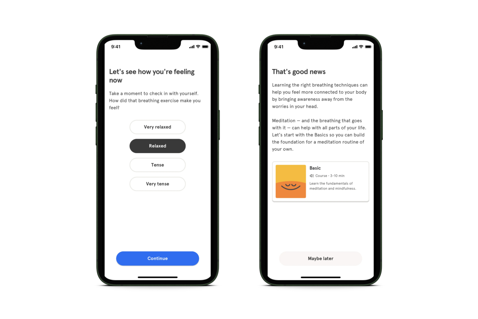
So, after users have just felt the app’s benefits and are excited to explore more, why not lead them directly to the main dashboard?
By posing the question “How are you feeling now?” Headspace opens a dialogue with the user. Rather than a one-sided speech, Headspace’s onboarding is a two-way conversation. It’s like attending a meditation class with your personal instructor.
Main Takeways
- The Headspace user onboarding flow is designed with three main goals in mind: educating users, setting up their accounts, and personalizing their experience.
- This onboarding journey consists of several stages, including a welcoming screen, a sign-up screen, a value-oriented screen, a personalization step, a notification for the paywall, and even a sample meditation.
- The process is interactive, activating users with intriguing questions and a sample meditation session.
- The paywall is introduced just after the personalization screens, seamlessly integrating it into the onboarding experience.
- An intriguing testing opportunity lies in placing the paywall after the sample meditation. This strategy could yield some interesting insights into user behavior and preferences.
Waze: A Minimal User Onboarding Flow
Waze has become a widely-used navigation app known for its live traffic alerts and data contributed by users. Unlike traditional GPS apps, Waze is a community-based platform that turns navigation into a collective effort.
In 2022, Waze secured the second-highest number of downloads among mapping apps in the United States, topped only by Google Maps.
What user onboarding flow does Waze use, and why?
Waze uses a minimal onboarding flow to ensure an efficient and user-friendly experience. This approach prioritizes quick access to navigation, reduces friction, and respects users’ time.
Waze’s simple user interface and familiar design allow new users to begin using the app without extensive setup, making it particularly convenient for on-the-go usage.
The Welcome Screen

When you open the Waze app, the first thing you’ll see is a screen that explains why the app is useful. This is a pretty typical way to start. Usually, the welcome and value screens are combined and placed at the beginning of the onboarding.
You can then swipe through three screens, each of which will show you a different benefit of using the app.
💡 The Chunking Effect
Chunking is a cognitive technique that involves breaking down extensive information into smaller, organized units or “chunks.” This helps enhance memory and processing by reducing cognitive load and improving retention. Whether learning new concepts or mastering skills, chunking optimizes information absorption and recall, making it a valuable strategy for efficient learning.
The Sign-In Screen

After the Welcome Screen, Waze directs users to a Sign-In Screen. Here, users have two options: they can either create an account or decide to skip this step for the time being.
Allowing users to skip the sign-in process at the beginning offers several benefits:
- User Convenience: It provides a seamless and frictionless experience for users who might be in a hurry or want to explore the app before committing to signing up.
- Reduced Abandonment: By removing the initial barrier of sign-in, you can prevent potential users from abandoning the app due to registration fatigue or privacy concerns.
- Positive First Impression: Allowing exploration without immediate sign-in creates a positive first impression, fostering goodwill and increasing the likelihood of users returning.
Navigation

And that’s all there is to Waze’s onboarding flow. Now the user is all set to begin their navigation. They can enter their destination, select a route, and Waze will start giving them step-by-step directions as they go along.
Main Takeaways
- The Waze onboarding flow focuses on two key goals: to educate users and set up their accounts.
- The onboarding flow takes a minimal approach, swiftly directing users to the main navigation screen for independent exploration. This minimalistic user onboarding style aligns well with straightforward utility apps like Waze.
- An optional sign-up is included to make things smoother and reduce any potential friction.
Blinkist: A Personalized User Onboarding Flow
The Blinkist app offers quick 15-minute summaries of popular books and podcasts. By providing users with quick access to valuable insights and knowledge across a variety of topics, the tool is designed to facilitate efficient learning and personal growth.
The company claims to have over 26 million users worldwide.
What user onboarding flow does Blinkist use, and why?
Blinkist employs a personalized onboarding flow in which new users answer questions about their interests. This helps Blinkist create a customized dashboard with book and podcast summaries that match each user’s preferences.
This customized approach enhances the app’s overall user experience and increases engagement.
The Welcome Screen

The Welcome Screen is essential to any great user onboarding flow, and Blinkist is no exception.
While it might seem tempting to dive straight into personalization, it’s actually more effective to take a different approach. Instead, including a welcome screen is a smart move to motivate new users to continue and engage with the questions ahead.
Blinkist also effectively communicates its core value proposition in one short sentence: “Understand powerful ideas in 15 minutes.”
To further enhance the experience, the app includes illustrations of well-known books. These recognizable images act as cognitive triggers, smoothing the transition from the initial interaction to a deeper and more engaging level of involvement.
Personalization

A large chunk of Blinkist’s user onboarding flow is dedicated to a series of questions designed to understand user preferences.
Blinkist nails this part by:
- Providing users with a manageable number of options to tailor their experience—too many choices lead to decision fatigue and cause them to lose interest.
- Incorporating a progress bar to visually lead users through the process—when users witness their advancement, it instills a sense of achievement and motivates them to proceed with the onboarding.
One of the most exciting aspects of this onboarding flow is the app’s presentation of well-known books, allowing users to vote for their preferences.
The chosen selections are then saved in the user’s library. This clever approach creates a sense of anticipation, building excitement for the upcoming app experience.

💡 Endowment Effect
The endowment effect refers to a cognitive bias where individuals assign higher value to things they own or have a perceived attachment to. In the context of user experience, when users invest time and effort into personalizing an app to suit their preferences, they can develop a sense of ownership over the customized version. As a result, they tend to attribute a greater value to the app than they might to a standard version.
The Paywall

Introducing a paywall after the personalization stage of onboarding has several benefits, which can be explained using three psychological principles:
- Commitment: Users who’ve engaged in personalization are more inclined to subscribe.
- Ownership: Personalized content feels valuable and worth the monetary investment.
- Scarcity: The presence of a paywall generates a sense of urgency, and users don’t want to miss out.
Incorporating a paywall after personalization is consistent with a user-centric approach, which leverages psychological factors and strategically guides users toward considering and potentially embracing a paid subscription.
This approach capitalizes on our psychological tendencies, making the transition from free to paid feel more seamless and compelling.
Main Takeaways
- Blinkist effectively utilizes a personalized onboarding approach, tailoring the user experience to individual preferences and needs.
- The app strategically introduces a paywall immediately after users have engaged in a series of personalized questions. This timing leverages the sense of ownership users feel over their customized experience, making the paid content seem even more valuable.
- Blinkist chooses not to prioritize initial sign-up as the primary focus. Instead, it postpones the account creation process to a later stage, allowing users to first experience the app’s value and benefits before making a commitment.
Evernote: A Tutorial User Onboarding Flow
Evernote is a note-taking and organization app that allows users to capture, store, and organize various types of information across different devices. It was designed to help users keep track of their ideas, tasks, research, notes, images, and other digital content in a unified and easily accessible platform.
In July 2023, Evernote’s total mobile app revenue was $2 million.
How does Evernote onboard its users, and why?
Evernote employs a tutorial onboarding approach to provide users with a smooth and intuitive introduction to its diverse features.
Given the app’s versatility, the tutorial onboarding method is particularly effective in helping users unlock Evernote’s potential while ensuring a positive first-time experience.
The Instructional Onboarding Screens

Typical for a tutorial flow, Evernote’s onboarding begins with a series of informative screens to guide the user.
Evernote takes a unique approach by introducing users to its USP right away. Rather than a typical value introduction, it engages users by inviting them to “create your first note.”
The app ensures that this portion of the journey is user-friendly with these methods:
- A progress bar that displays how much of the tutorial is left.
- Simplified choices to help users make decisions more swiftly.
- Illustrations that complement the text, enhancing clarity and speeding up user comprehension.
💡 The Planning Fallacy
The Planning Fallacy is a cognitive bias where individuals tend to underestimate the time and resources needed to complete a task, leading to overly optimistic expectations. To counter this bias in the context of onboarding, it’s essential to provide accurate time and effort estimates for each step of the process. Additionally, offering readily available support or assistance can help users navigate any unexpected challenges they may encounter.
The Tooltip Screens
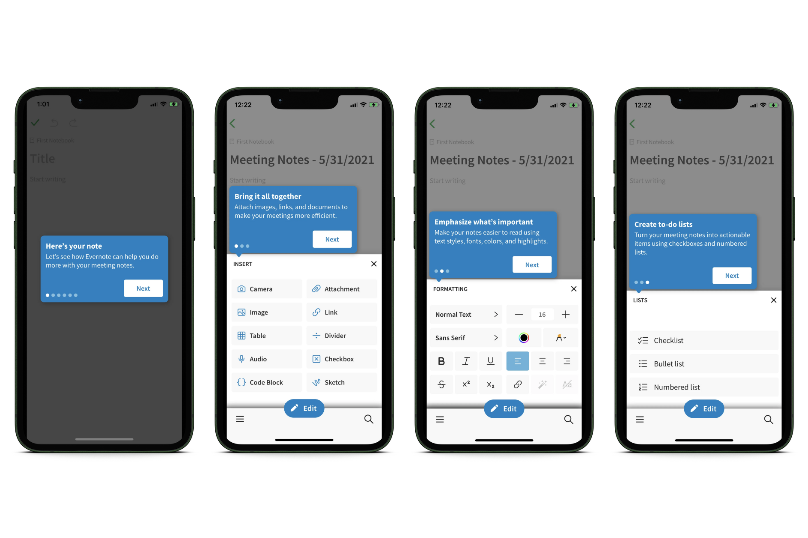
Evernote employs a clever strategy called tooltips, which involves using small, informative pop-up messages to assist users as they navigate the app.
- Contextual Guidance: These tooltips are designed to appear at moments that align with the user’s actions within the app. For instance, when a user creates a new note, a relevant tooltip will pop up, guiding them on tasks such as adding images or formatting text.
- Progressive Information: Evernote introduces these tooltips gradually, ensuring that users are provided with information in manageable portions, preventing any feelings of being overwhelmed.
- Visual Cues: To enhance the effectiveness of tooltips, the app combines them with visual cues. These cues, like highlights or indicators, draw the user’s attention to the specific elements of the user interface being explained by the tooltip.
Main Takeaways
- The primary objective of the Evernote app is to educate users and assist them in setting up their accounts. The initial account setup is prioritized to ensure that all subsequent progress during the onboarding process is saved.
- Evernote employs a tutorial onboarding flow to cater to its nature as a feature-rich application with diverse functionalities. It uses tooltips to guide users while they navigate the app. These small, contextual pop-up messages provide progressive information aligned with users’ actions, enhancing comprehension. Visual cues are used in combination with tooltips to draw attention to specific elements on the user interface.
How to Select the Right User Onboarding Flow for Your App
Not all user onboarding flows work universally for all types of apps; there’s no “one-size-fits-all” solution.
When it comes to choosing the most suitable flow for your app, several factors come into play. Here’s a step-by-step approach to help you make the best choice:
- Understand Your Target Audience: Begin by analyzing your target audience’s preferences, familiarity with similar apps, and overall tech-savviness. Then, choose an onboarding flow that aligns with the typical user’s expectations and usability comfort.
- Analyze Your App’s Purpose and Complexity: Consider your app’s intricacies and the range of features it offers. A progressive onboarding flow may be appropriate for more complex apps, whereas simpler apps can benefit from minimal onboarding experiences.
- Balance User Experience and Engagement: Try to strike a balance between providing a smooth user experience and engaging users with interactive or gamified elements. The onboarding experience should be informative but not overwhelming.
- Conduct A/B Testing and Gather User Feedback: Test different types of onboarding flows with a subset of users (A/B testing). This allows you to gather valuable insights into which flow resonates best with your audience.
- Iterate and Improve: Continuous improvement is the key to a successful onboarding strategy. Utilize the feedback and analytics acquired from the A/B testing to iterate and enhance the onboarding experience over time. By staying open to refining the process, you can ensure your app’s onboarding evolves alongside your users’ needs and preferences.
In essence, crafting an impactful user onboarding experience requires a holistic approach. By truly understanding your audience, engaging in meaningful dialogue with them, and rigorously testing different approaches, you can create the most effective and valuable onboarding experience for your app.
It goes beyond following a simple checklist; it’s about combining tried-and-true methods with genuine insights from existing users. At the end of the day, it’s this mix of data-driven decisions and real-world feedback that will set your app apart and ensure users feel both understood and engaged.
Final Thoughts
So, as we wrap things up, think of mobile app onboarding as welcoming someone to your home. You want them to feel comfortable, excited, and ready to explore.
Remember, there’s no one-size-fits-all approach. You’ve got options – whether it’s making the first steps fun, keeping things super simple, tailoring the experience just for them, or giving a step-by-step tour. Learn from popular apps and see what works for your app’s personality.
And just like a good host, keep listening and learning. Improve your onboarding based on what your guests – in this case, your users – tell you. That way, you’ll create an app experience that not only gets users in the door but keeps them coming back for more.
Tell us if you liked the article, and we’ll show you more app onboarding flow examples to check out.


