Every day, Apple seems to be getting stricter with store assets. At least, that’s what we at AppAgent and other publishers have experienced. It’s increasingly common for app previews to be rejected because they “do not sufficiently reflect the app in use”.
Here’s a summary of what we’ve learned about Apple App Store preview videos. We hope it keeps you from getting into trouble.
WHY APPLE REJECTS APP STORE PREVIEW VIDEOS
In our experience, Apple usually rejects app previews for several key reasons:
- The app preview includes device images and/or device frames.
- The app preview shows footage other than the app in use.
- The app preview features a manipulated or removed user interface.
- There’s a mismatch between the app footage and the video dimensions (e.g. an iPhone X video shows app footage from iPhone 6/7/8).
Apple’s guidelines are becoming more stringent every year. As mobile growth strategists, we’ve observed that they reject videos that do not sufficiently showcase the app in use or inaccurately represent the app’s functionality.
For instance, fake device frames or stock footage often result in immediate rejection. This is in part to prevent misrepresentation of the app experience for users. Apple wants to see authentic content reflecting how the app will appear and function for its users.
REAL LIFE EXAMPLES OF APP PREVIEW REJECTIONS
To help illustrate our point, here’s a real-time example of the evolution of an App Store preview video for Kiwi.com. At AppAgent, we are responsible for Kiwi.com’s overall mobile growth, including designing all ASO materials and ad creatives.
In the second version of Kiwi.com’s preview video, we changed the orientation of the app preview from landscape to portrait. We also removed initial visual tricks (like fake screenshots) and suppressed device frames to ensure compliance.
Unfortunately, Apple still rejected it.
The version that finally passed the review was a simplified version, focusing purely on app functionality with no extra design enhancements. From the users’ perspective, the message and the focus on functionality remained the same, but Apple cared more about specific details in the execution.
We often use animation principles like enlarged elements or a simplified UI in our app previews because they guide users’ eyes easily. Apple used to approve landscape videos for portrait apps, but this now seems to be a problem.
Another AppAgent example we can use is Joom. Launched in 2016, Joom is a shopping app that has been downloaded over 130 million times. In this case, the App Store preview below was approved at first, but was then rejected two months after it was published.
So, what did we do?
We removed the video to push the update through and then added it back a few weeks later with the next release. At this point, it successfully passed the review process.
The next update, however, was rejected because Apple had concerns about the video. Currently, there are no app preview videos in the Apple App Store for Joom.
APPLE'S DESIGN GUIDELINES FOR APP PREVIEWS & Screenshots
Apple’s design guidelines for app previews emphasize clarity, simplicity, and real-world usability. The main goal is to showcase the app’s core functionality in a manner that feels intuitive and aligns with the user’s expectations.
Some additional insights we’ve gathered include:
Avoid Device Frames
Device frames are a common reason for rejection, especially in landscape app previews. Apple does not approve videos that include device imagery or any device UI that does not exist on the device in the video.
Rodrigo Mello from Jogatina shared with me his experience of Apple deciding to reject an iPad app preview. The preview featured a device frame as well as a device button that the iPad Pro 3rd Generation does not have.
This was enough to trigger a rejection
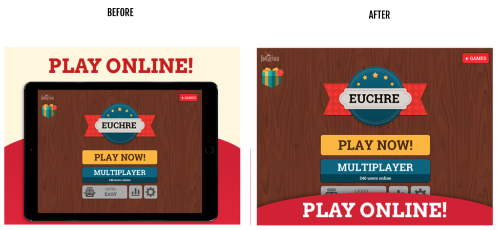
Michal Skvor from Avast confirms such rejections don’t just happen to small developers. The AVG Secure VPN app has millions of downloads but it too found its preview rejected because of a similar issue.
“Free” is a Nasty Word for Apple
Apple also rejected an app preview for Jogatina because it used the word “Free” in the poster frame. If you’re developing creatives, it’s crucial to know that Apple won’t allow words that make price referrals. Keep this in mind when designing your app previews.

Authenticity of UI
Manipulating the user interface or presenting a UI that does not reflect the app’s actual behavior will result in a rejection. Apple’s guidelines require that the UI shown in your preview matches what users experience in the app.
Primož Strajnar from Tricky Tribe Ltd. received a rejection because Apple claimed he had manipulated screenshots. The review stated that the majority of screenshots did not sufficiently reflect the app in use.
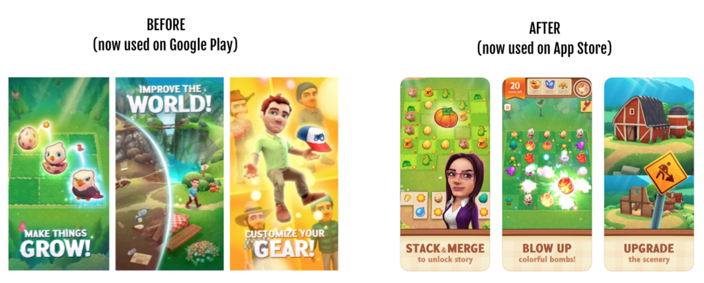
The important part of this feedback is the use of the term ‘the majority’. This indicates that using marketing visuals aren’t always a problem, but it’s crucial that the core experience is clearly demonstrated in most of the screens.
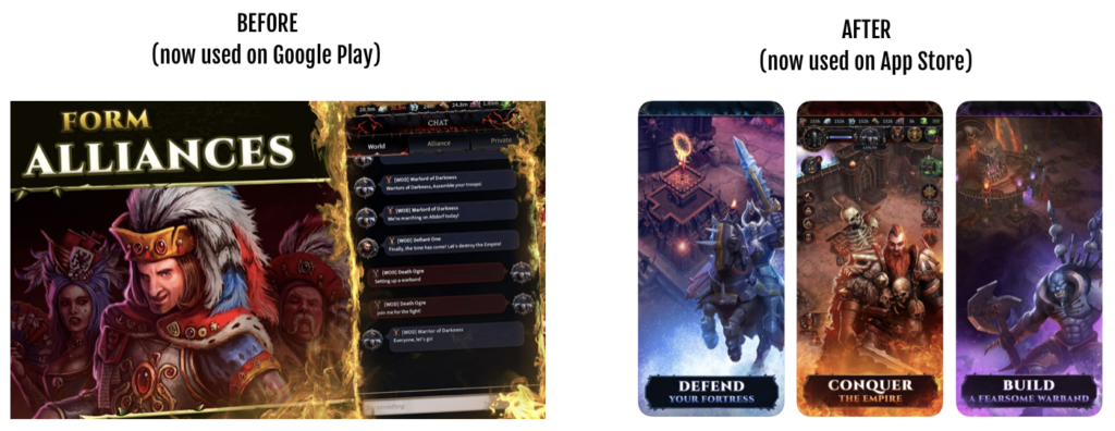
Nadir Garouche, ex-Senior Growth Manager at NY-based Tilting Point, describes their most recent rejection for its game Warhammer: Chaos and Conquest:
“We wanted to use the same screenshots that we had on Google Play where we use some artwork next to gameplay images. It’s quite preponderant, but we saw that the audience on Google Play liked it very much if we look at the CVR uplift it brought.”
Initially, Tilting Point found – to their surprise – that the submitted screenshots were approved, but the rejection came with another update. They received the following explanation, which is similar to what Tricky Tribe saw: “The majority of the screenshots do not clearly and sufficiently display the game’s UI.”
The final approved set is the original one showing more gameplay where the art on top of that didn’t occupy too much real estate.
Focus on functionality
Instead of flashy effects or transitions, showcase how the app works and how users can interact with it.
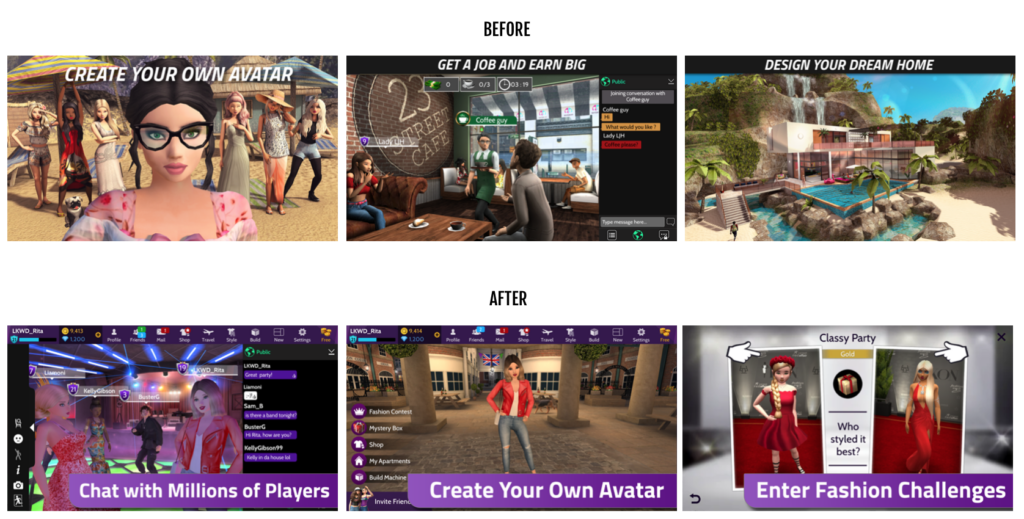
Lockwood, an AppAgent client, recently experienced Apple App Store rejection too. Lisa Schaeffer, marketing manager for the game Avakin Life, is happy to share a part of Apple’s review: “App Store screenshots should accurately communicate your app’s value and functionality. Use text and overlay images to highlight your app’s user experience, not obscure it.”
To gain approval, the team had to redesign all screenshots completely.
If you want to learn more about how to design compelling store creatives, check out the App Store and Google Play Store best practices that we internally follow at AppAgent.
BEST PRACTICES FOR DESIGNING APPLE APP STORE PREVIEW VIDEOS
To prevent rejection and improve the likelihood of Apple Store approval, follow these best practices:
-
Use real app footage: Avoid using any external content (e.g., stock footage, placeholders) and stick to real app footage that shows the app being used as intended.
-
Highlight key features: Show the app’s main features, ensuring that the preview conveys clear value to the viewer.
-
Match the video dimensions with the device: Ensure that the preview video is sized properly for the device it’s intended for.
TEST THE LINE, BUT ALWAYS BACK UP
Kacper Chwaliński, ASO manager at Huuuge Games, summed it up perfectly: “Plain screenshots [and app previews] are a 100% safe solution, but probably aren’t the best choice from a business perspective.”
As marketers, we’re constantly balancing compliance with performance. Pushing creative boundaries is often the only way to squeeze more conversions from a competitive app store landscape. But every creative risk carries the potential for rejection — which is why you should always have a plan-B in place to manage any unnecessary delays in releasing a new update.
If you’re short on resources and time, prepare another concept ready ahead of time. This can be a stripped-down version of your preview, with fewer transitions, simplified animations, and nothing Apple could interpret as misrepresentation. Ideally, allocate design hours right after your initial submission to quickly adjust if needed.
When resources allow, having two creative directions lets you run an A/B test, both in Google Play and App Store post-approval — and in some cases, you might be surprised to see the “safer” version outperform the polished one.
A practical example from the game Love and Passion by Goodgame Studios shows part of the original video and part of the backup app preview video.
For the clarity of communication, we wanted to remove the UI, but no matter how good your intentions are, this could already be considered as manipulation of reality by Apple. Therefore, we developed this “plan B” in case of a rejection – so they could still move forward without delay.

This mindset doesn’t just apply to videos. Screenshots need the same level of preparation and honesty. A conservative variant that still captures the value of your app can be your ticket to staying live and visible — even if your boldest idea doesn’t pass Apple’s filters.
Pushing the limits can yield better results — but the only way to do it safely is to test the line and back it up.
HANDLING REJECTION: WHAT TO DO NEXT?
Even the best-prepared teams sometimes get a rejection. When that happens, don’t panic — respond with precision. Here’s your five-step post-rejection playbook:
-
Understand the Feedback
Apple typically provides a brief rationale. Look closely for language around UI manipulation, price references (e.g., “Free”), device frame usage, or video dimension mismatches. These are the usual suspects. -
Deploy Your Backup Creative
If you followed the “test the line” strategy, you’ll have a simplified version on hand. Swap it in to avoid delays and preserve your update schedule. -
Iterate with Focus
Fix only what was flagged. You don’t need a full overhaul — just enough to meet compliance. Maintain your original message and UX representation wherever possible. -
Monitor Results Post-Approval
After Apple approves the revised asset, keep an eye on performance. Use App Store CVR data and user feedback to determine whether the adjusted version still drives downloads — or if further tweaks are needed. -
Document What You Learn
Build a rejection-response log internally. Over time, patterns will emerge about what Apple is likely to flag. This intel can guide future designs and reduce risks long-term.
CONCLUSION: CREATIVITY MEETS COMPLIANCE
Navigating Apple’s review process for App Store assets requires a blend of bold creativity and operational discipline. Whether you’re designing preview videos or screenshots, always assume that what works for conversions might still raise flags — and prepare accordingly.
By testing the line, maintaining a ready-to-go backup, and having a post-rejection response plan, you’ll stay agile and avoid costly delays. And more importantly, you’ll ensure your app consistently delivers a strong, authentic, and compliant first impression.
When in doubt, lean into functionality, show the real experience, and use A/B testing to let performance data guide your creative risks.
I would like to thank all contributors who shared their stories with me, namely Lisa Schaeffer (Netspeak Games, ex-Lockwood), Jan Pollack (Wooga), Kacper Chwaliński (Huuuge Games), Nadir Garouche (Applovin, ex-Tilting Point), Primož Strajnar (Tricky Tribe), Michal Skvor (Avast), Rodrigo Mello e Souza (Gazeus Games, ex-Jogatina) and Jiri Chochlik (Tilting Point, ex-AppAgent), and David Pertl (both AppAgent).
REVIVING ROYALTY
A CLASH ROYALE ASO CASE STUDY
Discover how AppAgent elevated Clash Royale’s app store presence by incorporating captivating RPG-themed creatives.
Keep Reading
Interested in learning more about app store preview videos and mobile ad production?
Check out these articles on how to produce mobile ad creatives efficiently or how automation can simplify mobile ad production.
How do I prevent Apple from rejecting my app preview video?
One frequent reason for rejection is devices being displayed in landscape app store preview videos. It’s worth having a backup version ready in case of a rejection, as landscape videos have a more significant impact.
