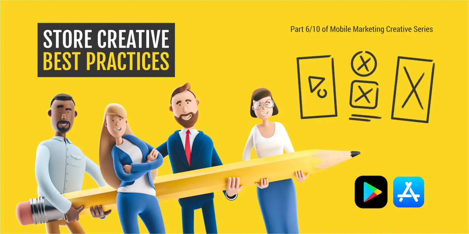
This is part six of our Mobile Marketing Creatives Series where we focus on ASO Best Practices for creative assets. In ten episodes, we aim to provide insight and inspiration on creating thumb-stopping visuals to promote your mobile app or game.
Download the Mobile Ad Creatives eBook today to read the other nine parts of this series. The comprehensive guide includes ten core topics condensed into a practical blueprint with examples from AppAgent’s Creative Team.
In this article, you will learn:
- How users make decisions about which app or game to download on app stores.
- How a hypothesis planner can effectively guide your ASO (App Store Optimization) efforts towards best practices.
- Techniques to create app store screenshots and feature graphics that stand out and attract more users.
- Actionable tips for designing compelling app icons and preview videos that drive conversion.
What is App Store Optimization (ASO), and what are the Best Practices for Creatives?
This is an excellent, detailed blog post on ASO best practices for creative assets, packed with valuable insights and practical tips. It clearly targets mobile app and game developers and marketers, which aligns perfectly with AppAgent’s audience.
Here’s a breakdown of how we can enhance it for high-intention keywords, SEO, interlinking, and added value:
ASO Best Practices: Designing App Store Creatives for Mobile Games & Apps (Part 6)
Meta Description Idea: Boost your mobile app or game downloads with our ASO best practices guide for creative assets. Learn how to design irresistible app icons, screenshots, and preview videos that convert store page visitors into loyal users.
Home » Blog » User Acquisition » ASO Best Practices: Designing App Store Creatives for Mobile Games & Apps (Part 6)
This is part six of our Mobile Marketing Creatives Series where we focus on ASO Best Practices for creative assets. In ten episodes, we aim to provide insight and inspiration on creating thumb-stopping visuals to promote your mobile app or game.
Download the
Mobile Ad Creatives eBook today to read the other nine parts of this series. This comprehensive guide includes ten core topics condensed into a practical blueprint with examples from AppAgent’s Creative Team.
In this article, you will learn:
- How users make decisions about which app or game to download on app stores.
- How a hypothesis planner can effectively guide your ASO (App Store Optimization) efforts towards best practices.
- Techniques to create app store screenshots and feature graphics that stand out and attract more users.
- Actionable tips for designing compelling app icons and preview videos that drive conversion.
What is App Store Optimization (ASO), and What are the Best Practices for Creatives?
App Store Optimization (ASO) is first and foremost a mid-funnel strategy for converting App Store and Google Play page visits into downloads. For mobile game developers and app publishers, mastering ASO is crucial for organic growth and maximizing your paid user acquisition efficiency.
There are two main areas of ASO: search optimization and conversion rate optimization (CRO). The former is primarily about optimizing keywords in the app title, subtitle, keyword field (Apple App Store) or app description (Google Play Store). While keyword optimization helps users find your app, creative optimization helps them download it.
What is Conversion Rate Optimization (CRO) for Mobile Apps?
In 95% of cases, most search traffic originates from users searching for specific brands, while a smaller portion comes from targeting competitors, and even less from generic terms.
Unless your app serves a niche where many users strongly intend to meet their needs through an app, like a fitness app for weight loss, you should heavily focus on conversion rate optimization (CRO). This is especially true for mobile games, where users often make quick, visually-driven decisions.
CRO is all about having a clear definition of an app’s purpose and understanding how to best position it for maximum appeal to an audience. Conversion is strongly influenced by visual elements on the store page, including an app’s icon, preview video, and screenshots. These are your primary tools for converting curious visitors into active users.
Key Insights on App Store User Behavior
Did you know that a mere 1% of users actually read an app description on the App Store? This highlights the immense power of your visual assets.
Here are some surprising facts about app store behavior that you should be aware of. These data points represent averages of both portrait and landscape views, considering data from both the Apple App Store and the Google Play Store:
- The average time spent on a store page is only 7 seconds (6.8 seconds to be precise). Decisive users spend even less time, while explorative users may spend around 20 to 30 seconds.
- Only 1 in every 10 users (exactly 13%) scrolls through screenshots. Additionally, less than 18% of viewers will see a screenshot in the second slot.
- The average user’s attention span while watching an app preview video is just 7 seconds. Moreover, only 8% of viewers watch the video until the end.
These insights mean one thing: your app’s presentation must be straightforward and immediate. It should clearly convey what your app represents right from the first impression frame that users encounter when they land on the store page. For mobile games, this often means showcasing core gameplay, unique mechanics, or compelling characters instantly.
How to Design App Store Icons, Screenshots, and App Preview Videos Effectively
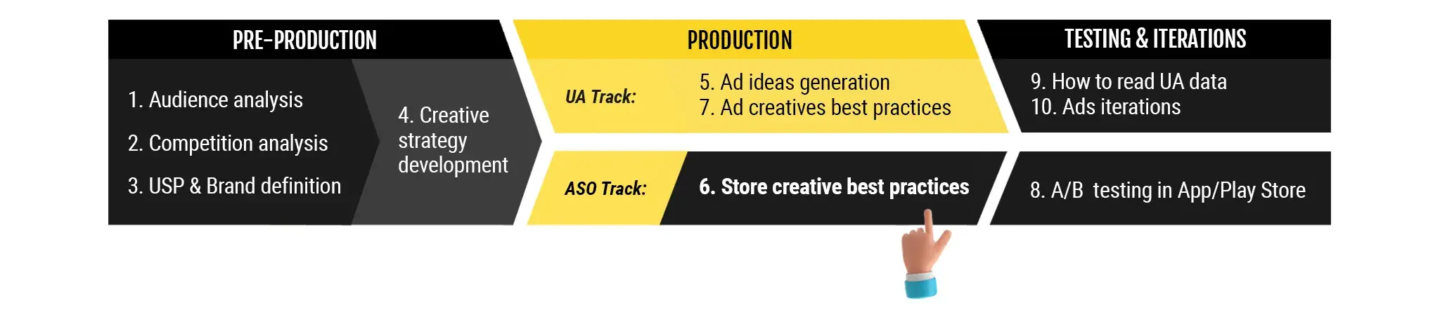
The design process starts with a solid creative strategy. Such a strategy is based on of three fundamental inputs covered in previous parts of the Creative Series:
- Audience analysis: Understanding your target players/users.
- Competition analysis: Identifying what works (and doesn’t) for similar apps and games.
- Unique Selling Proposition (USP) & brand definition: What makes your app unique and appealing.
With these building blocks in place, you and your design team should be 100% clear on what you want to communicate to your audience.
This is an excellent, detailed blog post on ASO best practices for creative assets, packed with valuable insights and practical tips. It clearly targets mobile app and game developers and marketers, which aligns perfectly with AppAgent’s audience.
Here’s a breakdown of how we can enhance it for high-intention keywords, SEO, interlinking, and added value:
ASO Best Practices: Designing App Store Creatives for Mobile Games & Apps (Part 6)
Meta Description Idea: Boost your mobile app or game downloads with our ASO best practices guide for creative assets. Learn how to design irresistible app icons, screenshots, and preview videos that convert store page visitors into loyal users.
Home » Blog » User Acquisition » ASO Best Practices: Designing App Store Creatives for Mobile Games & Apps (Part 6)
This is part six of our Mobile Marketing Creatives Series where we focus on ASO Best Practices for creative assets. In ten episodes, we aim to provide insight and inspiration on creating thumb-stopping visuals to promote your mobile app or game.
Download the
Mobile Ad Creatives eBook today to read the other nine parts of this series. This comprehensive guide includes ten core topics condensed into a practical blueprint with examples from AppAgent’s Creative Team.
In this article, you will learn:
- How users make decisions about which app or game to download on app stores.
- How a hypothesis planner can effectively guide your ASO (App Store Optimization) efforts towards best practices.
- Techniques to create app store screenshots and feature graphics that stand out and attract more users.
- Actionable tips for designing compelling app icons and preview videos that drive conversion.
What is App Store Optimization (ASO), and What are the Best Practices for Creatives?
App Store Optimization (ASO) is first and foremost a mid-funnel strategy for converting App Store and Google Play page visits into downloads. For mobile game developers and app publishers, mastering ASO is crucial for organic growth and maximizing your paid user acquisition efficiency.
There are two main areas of ASO: search optimization and conversion rate optimization (CRO). The former is primarily about optimizing keywords in the app title, subtitle, keyword field (Apple App Store) or app description (Google Play Store). While keyword optimization helps users find your app, creative optimization helps them download it.
What is Conversion Rate Optimization (CRO) for Mobile Apps?
In 95% of cases, most search traffic originates from users searching for specific brands, while a smaller portion comes from targeting competitors, and even less from generic terms.
Unless your app serves a niche where many users strongly intend to meet their needs through an app, like a fitness app for weight loss, you should heavily focus on conversion rate optimization (CRO). This is especially true for mobile games, where users often make quick, visually-driven decisions.
CRO is all about having a clear definition of an app’s purpose and understanding how to best position it for maximum appeal to an audience. Conversion is strongly influenced by visual elements on the store page, including an app’s icon, preview video, and screenshots. These are your primary tools for converting curious visitors into active users.
Key Insights on App Store User Behavior
Did you know that a mere 1% of users actually read an app description on the App Store? This highlights the immense power of your visual assets.
Here are some surprising facts about app store behavior that you should be aware of. These data points represent averages of both portrait and landscape views, considering data from both the Apple App Store and the Google Play Store:
- The average time spent on a store page is only 7 seconds (6.8 seconds to be precise). Decisive users spend even less time, while explorative users may spend around 20 to 30 seconds.
- Only 1 in every 10 users (exactly 13%) scrolls through screenshots. Additionally, less than 18% of viewers will see a screenshot in the second slot.
- The average user’s attention span while watching an app preview video is just 7 seconds. Moreover, only 8% of viewers watch the video until the end.
These insights mean one thing: your app’s presentation must be straightforward and immediate. It should clearly convey what your app represents right from the first impression frame that users encounter when they land on the store page. For mobile games, this often means showcasing core gameplay, unique mechanics, or compelling characters instantly.
How to Design App Store Icons, Screenshots, and App Preview Videos Effectively
The design process starts with a solid creative strategy. Such a strategy is based on three fundamental inputs covered in previous parts of the Creative Series:
- Audience analysis: Understanding your target players/users.
- Competition analysis: Identifying what works (and doesn’t) for similar apps and games.
- Unique Selling Proposition (USP) & brand definition: What makes your app unique and appealing.
When designing mobile ads and store pages, always remember that their purposes differ, and you should approach them with distinct strategies and goals.With these building blocks in place, you and your design team should be 100% clear on what you want to communicate to your audience through your app store creatives.
Paid user acquisition (UA) campaigns aimed at attracting clicks should provide viewers with at least 60% insight into the app or game’s content.
On the other hand, the store listing should offer 90% clarity on the benefits users will gain from downloading the app. This approach will lead to success in strong, top-of-the-funnel metrics like click-through-rate (CTR) and install rate, while also boosting retention rates and increasing the percentage of paying customers.When designing mobile ads and store pages, always remember that their purposes differ, and you should approach them with distinct strategies and goals.
Defining Priorities for App Store A/B Tests
At AppAgent, when analyzing our clients’ previous experiments, we often find that they focus too much on minor elements. Inspired by Phiture’s Experiment Flywheel, we developed our own guide called the ‘A/B Testing Loop.’
You can download the App Stores A/B Testing Loop framework framework HERE. This comprehensive guide outlines our systematic approach to optimizing your app store presence.
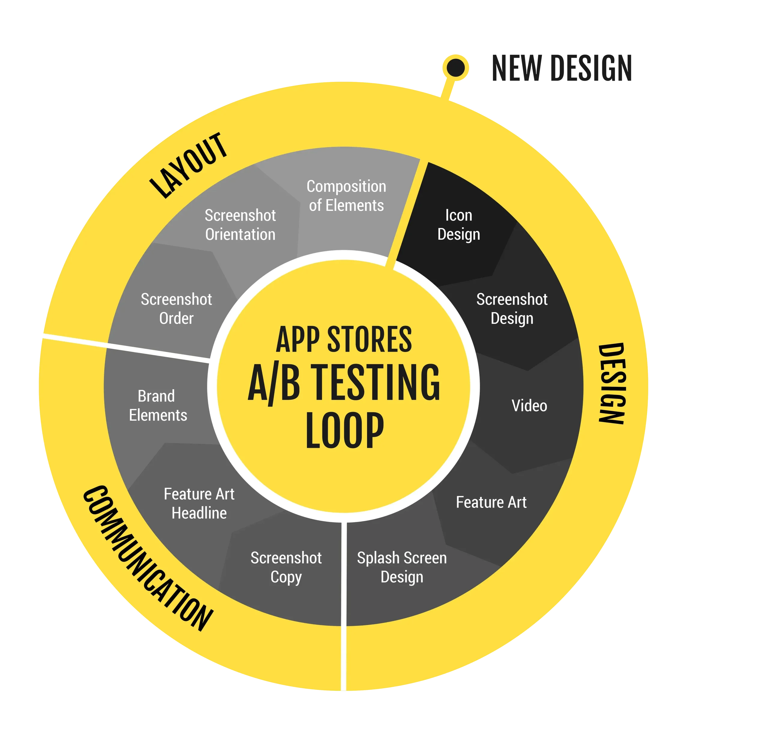
Design
Based on our experience, around 60% of positive ASO results stem from major design changes. Therefore, it’s crucial to give equal focus to both asset production and testing volume.
Key areas to consider for significant impact are:
- Design of new screenshots: Experimenting with new visual concepts and messaging.
- Icon design: The app icon is often the first visual impression; a strong icon is crucial for mobile game discoverability.
- Background color: Subtle changes here can impact overall visual appeal.
- App preview video and feature art design: These high-impact assets demand careful testing.
Communication
Approximately 20% of your investment should be allocated to experiments focusing on communication elements, including:
- Copy of your screenshots: Concise, benefit-driven headlines are key.
- Headline in the feature art: Optimizing this prominent text.
- Testing the impact of branding: How prominently your brand should be displayed.
- Playing with iconography in the video cover or first screenshot: Small visual cues can make a big difference.
Layout
In general, changes in layout are unlikely to lead to improvements of more than 20%. Nevertheless, it’s worth experimenting with the following elements:
- Order of screenshots: The sequence can tell a story and highlight different features.
- Orientation of screenshots: Portrait vs. landscape can impact engagement.
- Layout of visual elements in the icon, screenshots, and feature art: How information is arranged within the creative.
- Size/position of headlines in screenshots: Readability and emphasis are vital.
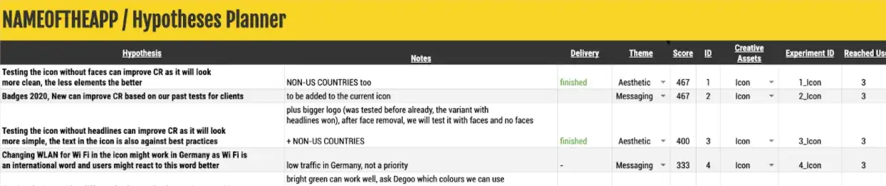
Leveraging a Hypothesis Planner for ASO Success
To maintain organization and prioritize your main goals effectively, you can utilize a hypothesis planner. This is a straightforward document in which you outline the reasons why you expect a particular A/B test to yield positive results.
For a more advanced approach, you can incorporate a scoring system into the planner. This helps you determine which experiments to prioritize and execute first. The scoring system can consider variables such as:
- Visibility of the asset: How prominently the asset appears on the store page.
- Ease of production: Cost and time associated with creating the new asset.
- Relevance to previous insights: Building on past learnings to inform future tests.
By evaluating these factors, you can calculate the final score for each hypothesis and make informed decisions accordingly.
The App Store Listing Design Process: From Concept to Conversion
If your team has already completed past store experiments, you should leverage these insights that have been proven to increase conversion rate. This historical data is invaluable for predicting future success.
In case you don’t have such information available, you can pre-test these ideas using existing assets before investing in the creation of a new set.
For example, you can pre-test:
- The order of screenshots to establish which key message in the first impression frame converts users the best.
- Removing screenshot headlines to eventually save resources on localizations.
- Adding a brand in your feature art or first screenshot.
- Removing the video completely to again save resources, especially if your current video isn’t performing well.
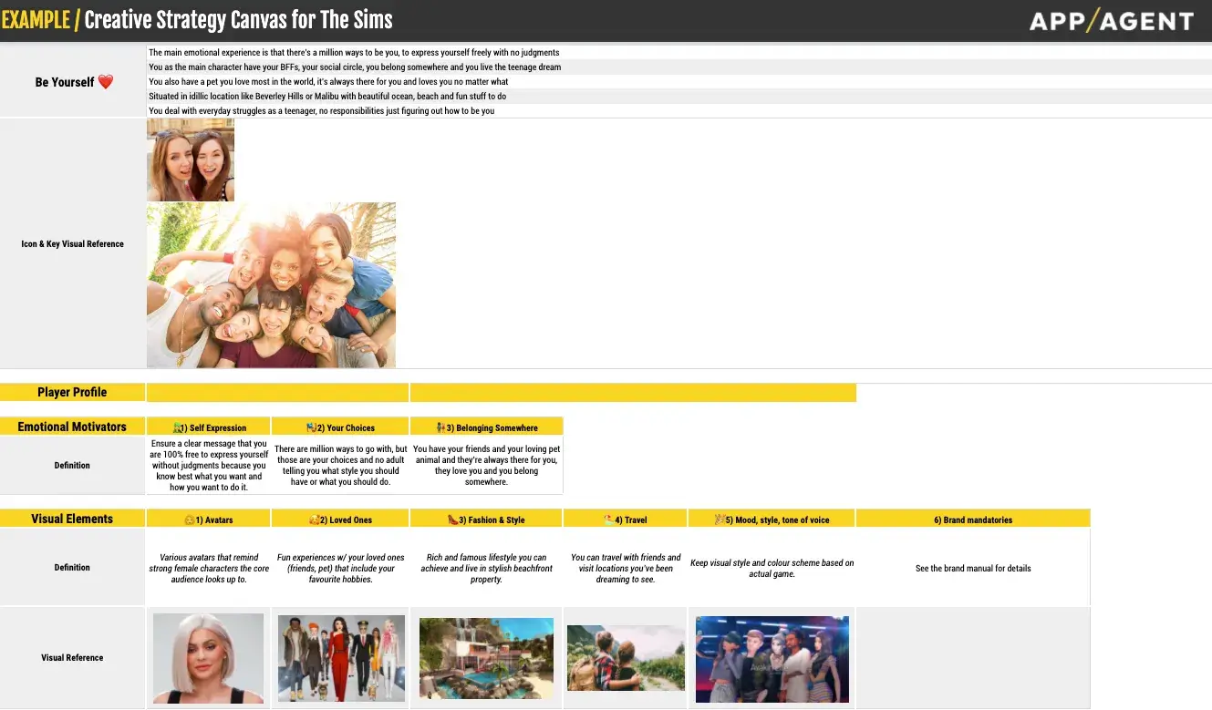
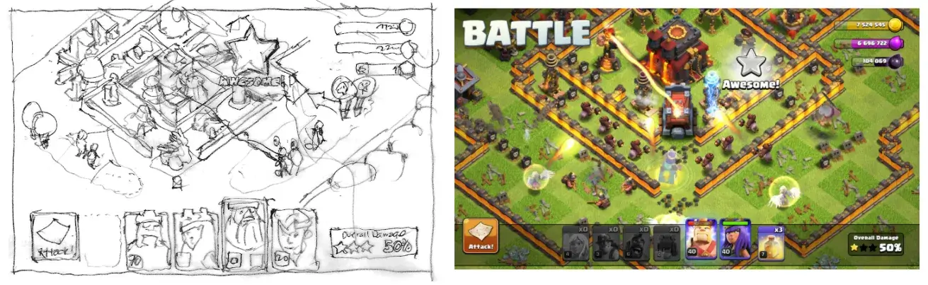
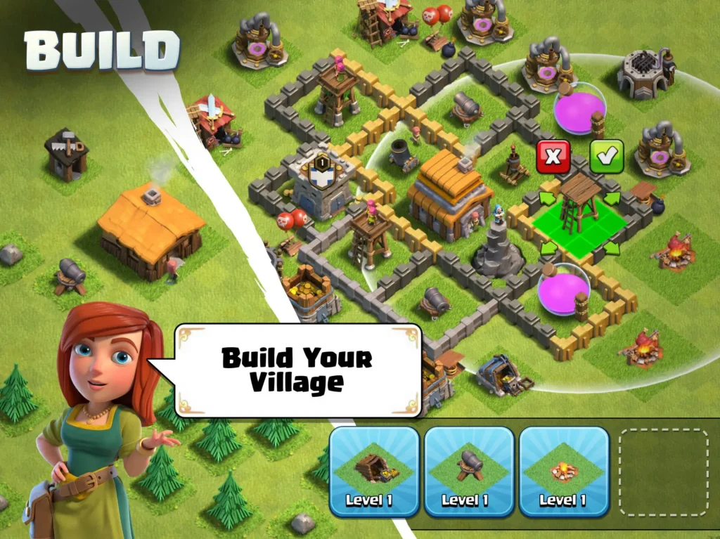
When creating new concepts at AppAgent, we find it beneficial to start with sketches. These sketches help us align the content first, ensuring that our clients are well-prepared and won’t be surprised by the details.
Moreover, the sketches act as guides for designers to stay true to the original vision. Below, you can see a comparison between a concept sketch and the final screenshot design for Clash of Clans, a client from our portfolio.
Clash of Clans “Relax” Case Study for more insights into creative breakthroughs.
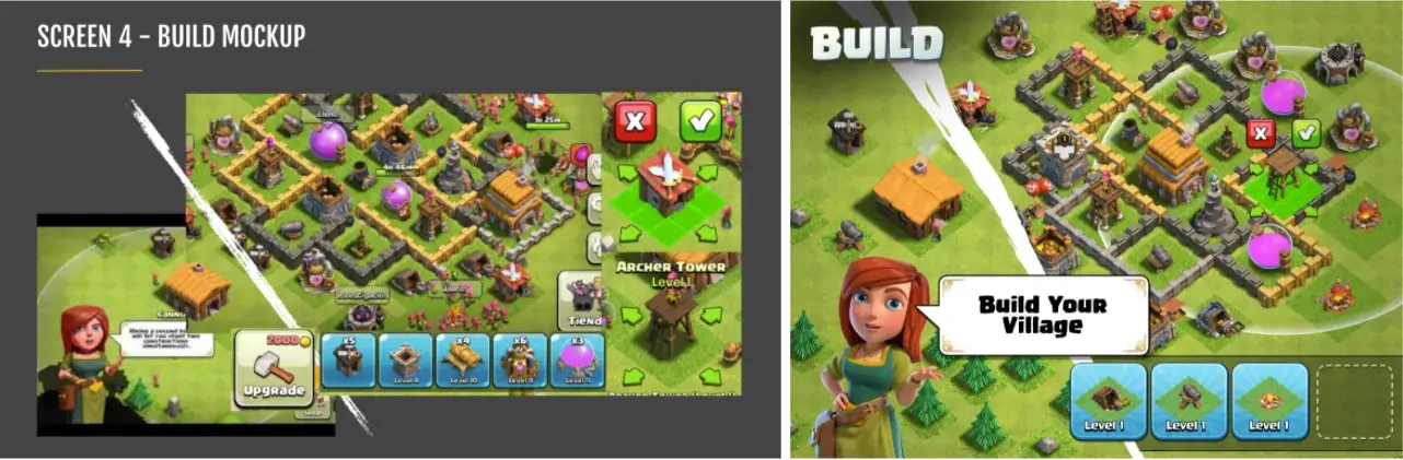
If necessary, you can create a mockup using existing game visuals in Powerpoint or Keynote. This simple mockup can effectively demonstrate the design direction of your ads.
Another recommendation is to maintain simplicity while designing new assets. Begin by testing them in English only, starting with static assets, and refrain from creating videos initially. Video production can be costly and should only incorporate the insights gained from screenshot testing. To learn more about video ad best practices, check out our How to Create Mobile Video Ads for Apps & Games or Mobile Video Ads Specifications Cheat Sheet resources.
If you find that using headlines in visuals doesn’t significantly improve your store presence, it’s best to avoid them. This way, you can save resources for future localization needs.
8 ASO Best Practices for App Store Design That Drive Downloads
Below are eight valuable tips that serve as AppAgent’s guiding principles for our team of idea makers and designers. To better understand these principles, take a look at examples created by our internal creative team, applying these ASO best practices for app and game creatives.
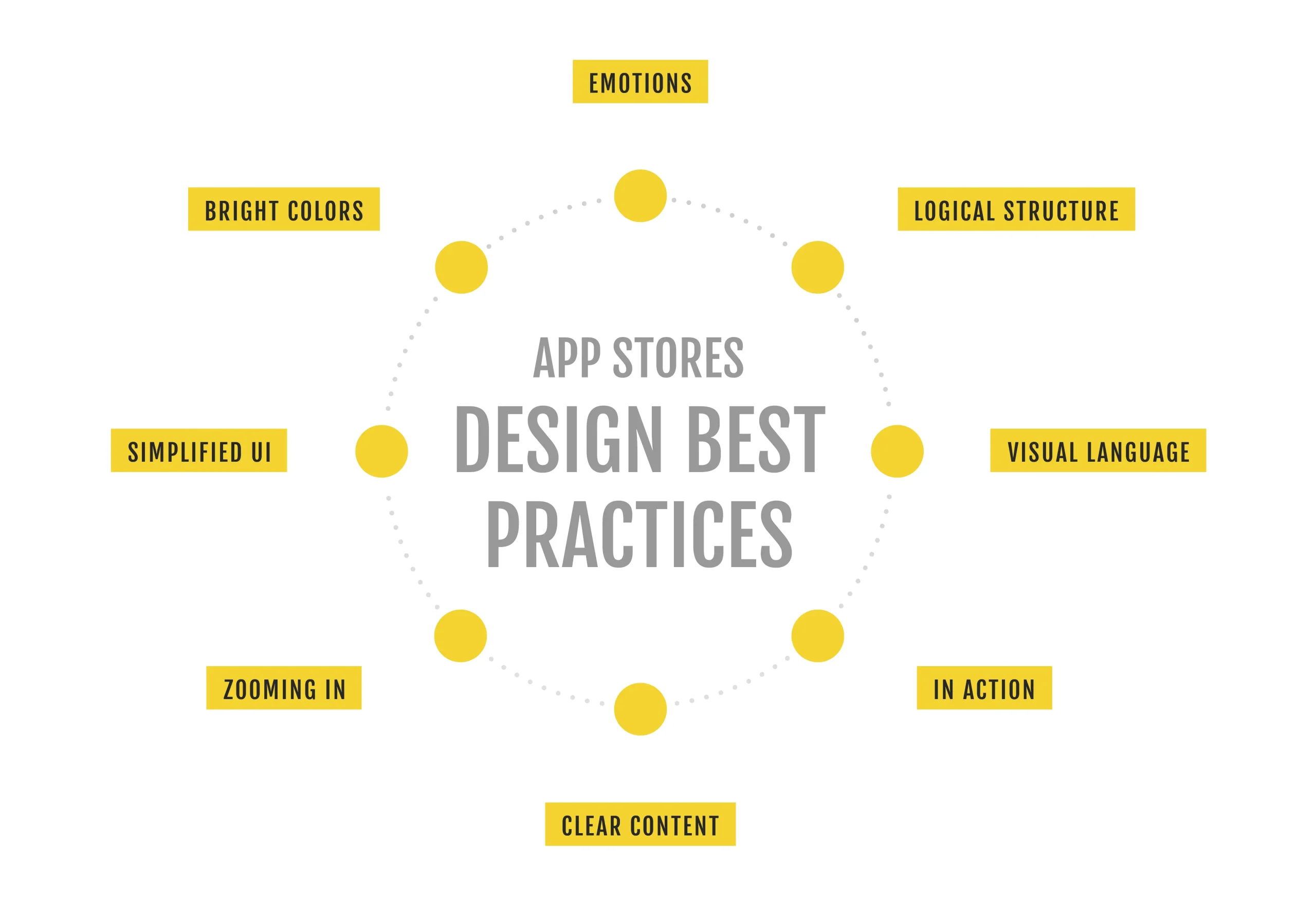
1. Logical Structure
A creative strategy canvas outlines the purpose of each asset, from the icon to the fifth screenshot. Stick to the communication plan and focus on testing different executions through A/B testing to assess their effectiveness.
2. Employ a visual language
Your screenshots and feature graphics should effectively convey messages visually. To test this, try removing headlines from any asset and ask people around you what they think the screenshot is trying to communicate. This will help you assess the clarity of your visual messaging.
3. Show your app in action
When showcasing your app, make sure to demonstrate it in use. Show how it works, what’s happening on the screen, and how it enhances the overall user experience. For mobile games, this means showing actual gameplay, not just static concept art.
4. Use clear content
To prevent confusion, avoid overcrowding a limited space with too much information. Keep each asset focused on conveying just one key message. Simplicity is key for quick comprehension.
5. Zoom in
Given that people will view your design on a small screen, it’s crucial to enlarge major elements, keywords, or app UI components. This helps users better comprehend the message and ensures that important information stands out clearly, even on smaller screens.
6. Simplify User Interface (UI)
Although it can be tricky due to app store policies, aim to streamline the user interface and retain only essential elements when delivering your message. Be prepared with backup screenshots in case of rejection by the review team. Always prioritize clarity over showing every single UI element.
7. Use Bright Colors
If you study successful apps, especially popular mobile games, you’ll notice that they often use bright and vivid colors. This is because bright colors make it easy for users to quickly understand the image, especially on small screens, grabbing attention in a crowded app store.
8. Embrace Emotions
Mobile developers design experiences! To achieve impactful communication and align with ASO best practices, use strong emotions, combining powerful visuals and compelling words. Those who excel in this approach also achieve the best business results, just like Playrix or Tactile Games. Show the joy of winning, the thrill of adventure, or the satisfaction of problem-solving.
Creating a Backlog of App Store Experiments for Continuous ASO Improvement
Google Play and Apple App Store optimization (ASO) is all about continuous testing in order to understand best practices. To avoid going around in circles, make sure to monitor your learnings and progress.
To accomplish this, maintain your own experiment backlog, where you store all conducted experiments. Visually highlight the winners, note the conversion uplift, and record the main learnings that you can leverage in future experimentation cycles. This systematic approach will help refine your strategies and continually improve your app’s performance.
Final Thoughts on Mastering ASO Creative Best Practices
To achieve a high conversion rate (ideally 50%+ for organic traffic), it’s crucial to recognize that users often have little interest in your app initially. Their download decision happens almost instantly based on visual cues. Therefore, you must design a store page that aligns with your primary acquisition channel or ad to prevent confusion and reduce drop-offs in the acquisition funnel.
A creative strategy canvas offers valuable guidance on what you want to communicate. Meanwhile, a hypothesis planner aids in deciding what to test immediately and what to consider for later.
By starting with hand-sketches or mockups, you can swiftly align with stakeholders on the content of each asset. This approach facilitates efficient communication and ensures everyone involved is on the same page regarding the asset’s purpose and design.
To deliver clear and compelling visuals, designers should follow the eight tips above when executing concepts for icons, screenshots, and videos.
Once you’ve completed every experiment, the main results and learnings should be stored in your experiment backlog to help you improve over time and continuously optimize your mobile app’s presence in the app stores.