This is part seven of the Mobile Marketing Creatives Series and it’s all about mobile video ad best practices for Google & Facebook. In ten episodes, we aim to provide insight and inspiration on creating thumb-stopping visuals to promote your app.

Download the Mobile Ad Creatives eBook today to read the other nine parts of this series. The comprehensive guide includes ten core topics condensed into a practical blueprint with examples from AppAgent’s Creative Team.
In this article, you will learn:
- How video ad content consumption impacts advertisers and what it means for them.
- The 6 recommendations for creating mobile video ad, using best practices, frequently suggested by Facebook.
- The essential tips listed on Google’s checklist for creating successful video creatives.
How people consume Mobile Video Ads
In Part 5 of our series, we covered how to come up with a great creative direction and engaging content for mobile video ads. Now, we will shift our focus to creating a compelling narrative for your ads and share some design best practices.
Once you have a general idea or even a rough sketch of your video ad, it’s time to consider its structure.
Start by analyzing the historical data from your previous user acquisition campaigns. This will help you determine which networks and placements have been driving the highest traffic.
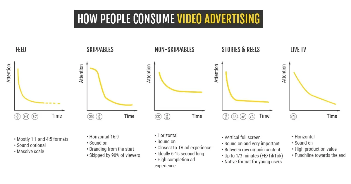
Keep in mind that the way people interact with your messages varies depending on where they appear, such as YouTube pre-roll, Instagram Stories, or the Facebook Feed.
1. Feeds
If the most common placement for your video ads is the feed on Facebook or Instagram, it’s crucial to use creatives that can rapidly convey your message or capture people’s attention within seconds.
2. Non-skippable mid-roll or pre-roll
For keeping your audience engaged, it’s recommended to use short videos lasting between 6 to 15 seconds. Incorporating sound elements like music, special effects, or dialogue can also be highly effective.
3. Skippable mid-roll or pre-roll
The majority of viewers will see a 5-second ad, while only around 10% or fewer will watch a 15-30-second ad. It’s essential to communicate your message clearly before the skip button appears!
4. Stories
This is a rapidly growing format that allows for sequencing to create a more engaging and involved narrative. While quality isn’t of utmost importance, music presents a massive opportunity to enhance the impact of the ad.
It’s evident that each ad placement demands a different attention span from viewers, there’s no once-size-fits-all. Understanding and catering to these varying attention spans can significantly impact the effectiveness of your video ads, ensuring that they resonate with your target audience and drive the desired results.
Active vs. Passive Attention: A Study of Eight Mobile Video Ads
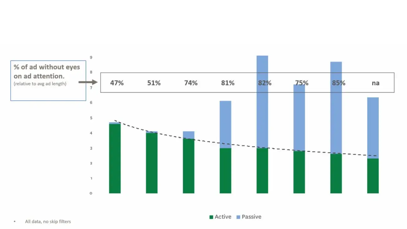
Attention peaks within the first three seconds, and users quickly move on to other things. So, it’s crucial to convey your main message instantly. Don’t be deceived; longer video ads don’t guarantee more attention; they often result in wastage (inattention).
According to the Cognition Neuroscience Research project, the human brain needs less than 0.5 seconds to engage with mobile ads and trigger a reaction.
Mobile Video Ad Best Practices for Creating Facebook Video Ads
Having worked extensively with Facebook (now Meta), we have gained valuable insights into the platform. Here is a list of frequent recommendations for Facebook video ads:
1. Capture viewer attention
Imagine the structure of Facebook video ads like an iceberg: the main message should be visible within the first 3-5 seconds, just like the tip of the iceberg. After that, you can delve into the details and add more substance to the content.
This Facebook video ad for the truck-safe navigation app Hammer cleverly uses text overlay to set an expectation of what comes next.
2. Showcase your brand early
Unlike traditional TV advertising, Facebook video ads require a different approach. It’s better to reverse the brand reveal by showing your brand early (logo, spokesperson, company color).
But why? Well, established brands can quickly connect with their fans in this way. For mobile brands, revealing the logo at the beginning of the ad helps build awareness and ensures a return on investment, even if the user doesn’t engage with the ad.
This Facebook video ad for Supercell uses prominent branding and the distinct king character to instantly create recognition for the game.
3. Keep the video ad short
It’s typically recommended to keep Facebook video ads no longer than 15 seconds. In some cases, they suggest creating videos as short as 6 seconds. This shorter duration works effectively in Stories and pre-roll placements.
This Facebook video ad for Design Home displays the target audience, CGI gameplay, and a strong call-to-action in the first 10 seconds.
4. Use Feed-Friendly Formats
According to mobile device intelligence experts, Scientiamobile, around 82% of visitors to video-centric websites hold their smartphones in portrait orientation. Considering this, it’s no wonder that Facebook mobile video ad is commonly in portrait (9:16), rectangle (4:5), or square (1:1) formats, which are best practices.
Additionally, Stories have specific features, such as the swipe mechanic. For detailed specifications, you can refer to the Instagram Stories Cheat Sheet.
This Facebook video ad for Kiwi.com, designed specifically for Stories, incorporates graphic elements that people commonly use independently.
5. Design the video ad for sound-off viewing
To engage users effectively, use visual storytelling. Employing text and graphics to convey your message is crucial, particularly in the initial seconds.
If you include dialogue or speech, make sure to add captions for users who may have their sound turned off or set to a low volume.
This Facebook video ad for Recolor is effective even without sound, but it becomes even better with the addition of music and sound effects (SFX).
6. Test Different Formats and Styles
Experiment with visual techniques that surprise Facebook users, like time-lapse, slow motion, split-screen, 3D elements, and more. Test various content and motivators to brainstorm fresh ideas, avoiding sticking to a style you’ve used previously.
Our advice is to iterate and stay innovative in your approach!
This highly successful Facebook video ad for Clash of Clans, created by AppAgent’s Creative Team, cleverly uses a visually catchy rewind effect.
7. CONNECT THE CTA WITH THE USER MOTIVATOR
Try experimenting with a call-to-action that relates directly to the motivator you’re addressing in your ad. For example, use “Upgrade Your Troops and Win” for a strategy game, “Help her” for a mysterious hidden object game, or “Order with free shipping” for an eCommerce app, instead of the classic “Download now.”
Being specific with your call-to-action can lead to better conversion rates!
In this Cats & Magic Facebook video ad, the CTA “We are waiting for you” is connected to the motivational driver of caring for others.
Dimensions for Video and Static Ads on Facebook & Instagram
For your convenience, here is an overview of the most frequent ad dimensions used on Facebook and Instagram.

Mobile Video Ad Best Practices for Google Video Ads
The Google checklist aligns with many of the tips mentioned above. Nevertheless, it’s essential to introduce some fresh points into your mobile video ads. For example, consider zooming in on key elements of the app or game interface and leveraging emotions to create a more impactful ad.
1. Use Navigating Hands
Featuring an app in use helps consumers to understand what its value is. By showing hands navigating the app, the viewer can understand exactly what’s happening.
The same principle applies to augmented visuals, where you can, for example, add graphical labels to describe functional benefits.
2. Connect with Viewers
After the opening sequence of your video ad, it’s essential to add emotions, create a plot, and develop the story to captivate your audience. Introduce a twist early in the ad to keep viewers engaged before you potentially lose their attention.
This Merge Mansion TV ad has a powerful start, a surprising twist, and evokes a wealth of emotions.
3. Design your ad to be seen
To enhance your app or game visuals, consider zooming into the app, enlarging key elements of the app’s user interface, and cleaning the gameplay from unnecessary elements. Increasing the contrast can also help to make the visuals more engaging and visually appealing.
In this video ad for Tiles & Tales, you’ll see an extremely simple and well-visualized gameplay that effectively showcases the game’s features.
4. ADD A STRONG ENDING AND DIRECT CALL TO ACTION (CTA)
All game ads need a surprise plot twist, a dash of humor, a clear Call-to-Action (CTA), and they should feature beloved in-game characters. For new games, it’s essential to use the search field to visually showcase the game’s name.

Take a look at the powerful call-to-action in this Clash of Clans video ad, which is connected to a social motivator.
Here’s an interesting tip that connects the first chapter of our Creative Series on designing ads with placements in mind to this one:
Google suggests using influencers, celebrities, and CGI (cinematic) video ads for Youtube pre or mid-roll placements if they perform well.
For the Google Display Network, ads focusing on gameplay, AR gameplay, and portrait orientation are more effective.
To scale your campaigns effectively on Google’s platform, remember this simple rule: create all possible formats and durations for your videos.
By doing this, you’ll unlock more advertising space and allow Google’s algorithm to find the best users for your video ads whenever they are available.
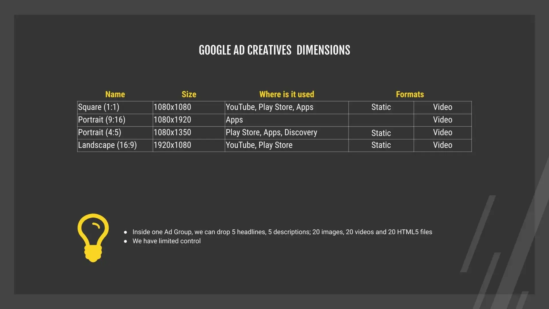
Dimensions for Static and Video Ads on Google
For your convenience, here is an overview of the most common creative dimensions for Google ads.
Final Thoughts
Once you’ve come up with a concept for your ad, consider the context in which people will engage with your message.
Remember, the first three seconds are crucial, as they determine whether viewers will take action. Unlike TV commercials, your ad’s narrative should start with the most important message, followed by the development of the story. Hooking the audience from the start is vital in capturing their attention amidst the flood of content they encounter daily.
Keep in mind that the average user may not pay close attention to your ad. Therefore, it’s essential to have clear visuals, a simplified interface, enlarged important elements, and use illustrated finger tapping on buttons. Also, make sure to communicate only one message per ad!
Once you’ve created a successful master video ad during initial performance testing, replicate it in all possible aspect ratios, lengths, and formats. This way, you can access a broader audience and attract the best users. 🚀
Mobile Ad Creatives eBook
How to Design Ads and App Store Creatives
A comprehensive guide to designing thumb-stopping visuals that will grow your user base and revenue.
